This pie chart shoes that when purchasing a CD the majority of my target audience actively look for the band name. This is probably because they are unlikely to buy a CD without knowing who the band is and I can also relate to this. When buying a CD the people I asked didn't look for an album name or bonus material - this suggests that my target audience isn't interested in these features/conventions. From this information, I have decided that I should definitely make sure that the band name is frequently used across the digipak. I will probably use it on the front cover, the CD and the spine - this will ensure that it can be seen.
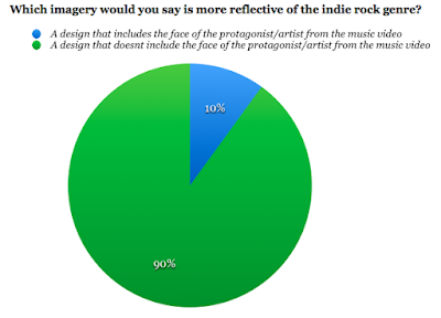
From this pie chart I was able to see that almost all of the people I asked within my target audience thinks that a design that doesn't include the face of the protagonist/artist from the music video would be the most reflective of my genre. This is good because this was the design that I was plaining on following throughout my digipak. However I might decide to include one or two images from my video just to make the cover slightly more interesting.
This pie chart shows that my target audience all have different ideas for what colour scheme they think would be the most appropriate for an indie rock digipak. However the majority thought that black, white and red would be the most appropriate colour scheme. I have already decided that I want the background colour for my digipak to be black. Therefore I think that I will also use red and white font for it. I think that I should use the white font for any small print because it won't be as bold as the red and I want to vary the colours on the digipak so that it doesn't look dull.
From this pie chart I have learnt that over half of the people I asked from my target audience would prefer to see a plain/simple design on my digipak. I think that this is a good idea because it will keep it minimalistic which is reflective of the genre and how it is more about the actual music. From my ideas I already planned to have a simple design for my digipak from looking at others for inspiration . Therefore this is reassuring to know that me and my target audience have the same ideas.
What would you expect to see on a digipak/album?
For this question, I gained a range of responses. It was useful to find out what people expected to see because it meant that I could take note and make sure that I include it on my digipak. The things that people said were the general conventions found on digipaks, some of the examples included; band name, barcode, track/song list, album title, the record label/company and an image.

