Showing posts with label Research. Show all posts

Monday, 20 February 2017

Music Video Final Draft: Target Audience Feedback

I wanted to find out what my target audience thought of the finished music video. Therefore I send them a link to the video using text messaging and asked what they thought. These were the responses:


Friday, 2 December 2016

Digipak Track List Research

I decided to look at the track listing for some albums by indie rock artists so that I could could an idea of the amount of songs bands usually include on their albums as well as what they name them.


I found that generally the albums tend to have around 10-12 songs which vary in length. From this information I decided to create an online poll so that I could find out how many tracks my target audience would like to see on my digipak. I created my poll online using a website called 'poll everywhere'. I then sent the link to people using social media and instant text messaging.


I sent this poll link out to 15 people, and these were the results:


From the results I can tell that my target audience would expect to see 9-11 songs on a digipak. This happens to be reflective of the research that I conducted into already existing indie rock albums. Because of this, I am going to include at least 11 songs on my digipak. I now need to come up with some names for them. Therefore I am going to research indie rock songs and see what they generally are called in order to make mine as similar to the conventions of the genre as possible.

Wednesday, 30 November 2016

Digipak Questionnaire Results

After giving my digipak questionnaire to 10 people I calculated the results and decided that it would be best to turn the answers into pie charts so that I could easily analyse the results.


This pie chart shoes that when purchasing a CD the majority of my target audience actively look for the band name. This is probably because they are unlikely to buy a CD without knowing who the band is and I can also relate to this. When buying a CD the people I asked didn't look for an album name or bonus material - this suggests that my target audience isn't interested in these features/conventions. From this information, I have decided that I should definitely make sure that the band name is frequently used across the digipak. I will probably use it on the front cover, the CD and the spine - this will ensure that it can be seen. 
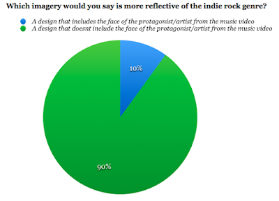

From this pie chart I was able to see that almost all of the people I asked within my target audience thinks that a design that doesn't include the face of the protagonist/artist from the music video would be the most reflective of my genre. This is good because this was the design that I was plaining on following throughout my digipak. However I might decide to include one or two images from my video just to make the cover slightly more interesting. 


This pie chart shows that my target audience all have different ideas for what colour scheme they think would be the most appropriate for an indie rock digipak. However the majority thought that black, white and red would be the most appropriate colour scheme. I have already decided that I want the background colour for my digipak to be black. Therefore I think that I will also use red and white font for it. I think that I should use the white font for any small print because it won't be as bold as the red and I want to vary the colours on the digipak so that it doesn't look dull. 


From this pie chart I have learnt that over half of the people I asked from my target audience would prefer to see a plain/simple design on my digipak. I think that this is a good idea because it will keep it minimalistic which is reflective of the genre and how it is more about the actual music. From my ideas I already planned to have a simple design for my digipak from looking at others for inspiration . Therefore this is reassuring to know that me and my target audience have the same ideas. 

What would you expect to see on a digipak/album?

For this question, I gained a range of responses. It was useful to find out what people expected to see because it meant that I could take note and make sure that I include it on my digipak. The things that people said were the general conventions found on digipaks, some of the examples included; band name, barcode, track/song list, album title, the record label/company and an image. 

Sunday, 27 November 2016

Digipak Questionnaire

I have decided to create a questionnaire in order to let me find out what my target audience thinks about digipaks in general and to help me narrow down some ideas for mu own digipak. I plan to give the questionnaire to at least 10-15 different people, who vary in age and gender so that I have a variety of answers that reflects the whole range of my target audience. I will then upload the responses/results to my blog to evaluate them.

Monday, 17 October 2016

The 1975 Light Performance

Earlier in the year, I went to the O2 Academy at Brixton and Reading Festival to see the 1975 perform live. When performing live the 1975 are known for their visual light show. The performance featured many different coloured backgrounds, strobe lighting as well as coloured projections. I was thinking about this recently and thought that the bands visual performance is good inspiration for my own music video. Therefore I went back and looked at the pictures that I took as well as looking at their live performances on YouTube so that I could draw inspiration and ideas from them.


From seeing the 1975 live and re-watching some of their performances, I have been able to gain inspiration for the lighting within my own music video. The visual show that the band put on is incredible and has inspired me to experiment with different colours and projections in my own music video. 

Sunday, 16 October 2016

Inspirations

As I want to experiment with colours and lighting within my music video. I decided to search for some music videos that gave me ideas and inspiration for lighting that I could use within my own music video. I found each video inspiring for a different reason, and I think that from watching these videos I have a better understanding of what it is I want to achieve with the lighting in my video.


In this music video, I was inspired by the use of strobe lighting. I liked how the strobe lighting was in time with the music and was used to change between scenes. The music video continued to show different women dancing to the music and running their hands over their bodies. This is something that I would like my Actor 2 to do, therefore I might show them this music video so that we can both get inspiration for movements that they can do. 


In this music video, I liked how colour filters had been used. The colour red was the dominant colour throughout the video, however some blue and purple was also used. Another thing that I liked in this video was the layering. Layering/overlapping of footage was constantly used throughout the music video; I think that this made the transitions between the clips smooth and made the video feel more dreamlike.


I like this video because of the red filter/lighting used throughout the music video. The colours on the screen continued to swap for the duration of the music video; the background would be black and the artists would be red and then the background would be red and the artists would be black. I like how this looked as it made the video more engaging by subtly changing the contrasts.


In this music video, I liked how cuts were made so that the background would change to the beat and pace of the song. I feel like this makes the video work better with the song, because it changes as the beat does. Another think I like about this music video, is how the lead singer really exaggerates his lip syncing for specific parts of the song. This is similar to how I want Actor 1 to lip-sync in my music video; therefore I will show him this video so that he can gain inspiration for his lip-syncing.


I like how two different colour filters/lighting (red and blue) have been used in thus music and then the footage has been overlapped. It makes the music video, appear almost 3D because of the colours and how it has been edited. 


Friday, 7 October 2016

Final Record Label Logo

After reading the feedback from my target audience, I decided to use some of their ideas to adjust my logo. This is because I want the record label to appeal to and interest my target audience. They suggested that I added a coloured background to the logo, in order to make it stand out when placed on a promotional magazine advert or album cover. They also recommended that I used a shape/boarder around it. From this I used Adobe Photoshop to add a light grey background; this was because it was a subtle colour and wouldn't be particularly distracting. For the border, I used a rhombus styled shape. This was because I thought that it would be more interesting than just a rectangle.

Overall I am happy with the final outcome for my logo. I think that it is simple yet effective. By listening to my audiences feedback, I was able to make the logo something that they thought was appropriate. Therefore it is now something that will appeal to them.

Tuesday, 4 October 2016

Social Media Responce: Record Label Logo Ideas

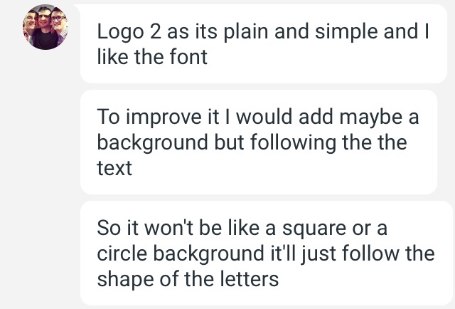
I wanted to gain feedback from my target audience about what they thought of my record label logo ideas. I sent them each logo and asked them to respond with, which one was their favourite and why. As well as with how they thought, the logo could be improved. I used social media sites such as whatsapp and google hangouts to get my feedback.


These were the replies: 


From this feedback I can see that my target audience generally prefer the second logo design. This is because it is simple and easier to read. However they did recommend that I made small adjustments to the colour of the background in order to make the font stand out more. I agree with my target audience and will therefore listen to their feedback and change my logos design accordingly.

Monday, 3 October 2016

Record Label Logo Ideas

I have come up with 5 different designs for my record labels logo. They are all relatively similar in terms of style, however I have experimented with font, colour and shapes. To find fonts that I wanted to use, I went to the website 'dafont.com' which had many different font styles available for free. There were two particular fonts that I liked, these were; 'Lemon Milk' and 'Delirium NCV. Both of these fonts were san serif fonts, this meant that they would be easier for my audience to read in comparison to a serif font. These are the previews of the fonts;


As I couldn't decide which font I preferred, I decided to create logos using both of them. I used Adobe Photoshop to design my logos. I used a variety of tools including, magic wand tool, shape tool, paintbrush tool and the transformation tool. In the end I had 5 different logo designs, these are;

Personally my favourite logo ideas are the ones in the bottom left and the top right. I think that these logos are simple yet effective. They are particularly easy to read and the minimalism of them is somewhat reflective of the indie rock genre. However as I am undecided on what logo I should choose, I am going to send my logo designs to people within my target audience to find out what logo design is their favourite and why. I shall also ask them if they think that it will be appropriate for an independent record label. 

Sunday, 2 October 2016

Social Media Responce: Record Label Name Ideas

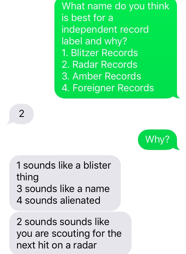
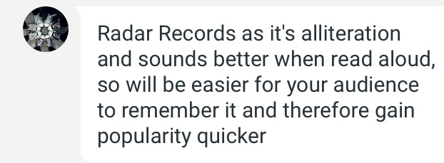
In order to get feedback from my target audience about what name they thought I should use for my record label, I decided to ask some of my friends who happen to be in the target audience. I used text messaging as well as Google Hangouts to ask them for their opinions. I sent them a message asking them to pick one of the name and give a reason for their choice. 

These were the replies: 


From these responses, I can tell that the majority of my target audience like the name 'Radar Records'. They like this name because it is catchy and memorable due to the alliteration. As mentioned previously, 'Radar Records' happened to be my favourite name idea for the same reasons. Therefore this will be the name that I use for my record company. 


Saturday, 1 October 2016

Record Label Name Ideas

From researching into different record labels, I have decided that I want my own record label to be both independent and successful. I have come up with a couple of different name ideas for my record label, these are; 
  1. Blitzer Records 
  2. Radar Records 
  3. Amber Records 
  4. Foreigner Records 
A common theme with all of these name ideas, is that they end in ‘R’. I decided this because I want my logo to have a large R in the middle and the first word in the top left hand corner and the second word in the bottom right hand corner. To look something similar to this:


I am still undecided on the font that I want to use for my logo. Therefore I plan on creating 3-5 different draft logos, so that I can gain feedback from my target audience on what one they think is the best.  I also want to put a shape around the text, to border it and make it stand out more. Im thinking either a circle or rectangle will be a good shape border for the logo, however I will also experiment with this in my drafts. 


Out of the 4 different name ideas that I have come up with my favourite is probably ‘Radar Records’. I think that the name sounds cool but also quite professional. I do also like ‘Blitzer Records’, however the word blitzer has multiple different meanings which might cause confusion amongst my target audience. Before I start to come up with designs for my logo, I am going to find out what name my target audience prefers and why. This will enable me to create a record label that my target audience are interested in.