Showing posts with label Planning. Show all posts

Wednesday, 18 January 2017

Music Video First Draft: Target Audience Feedback

I decided to show my target audience the first draft of my music video in order to find out what they thought about it. I asked them too tell me things that they liked and things that they didn't like/thought could be improved. These were the responses I received;

From this feedback, I have learnt that my target audience find my video engaging due to the fast pace shots and the range of colours used. However some did mention that they thought the footage used was occasionally repetitive. Because of this, I will go back to editing my first draft and change, remove and edit some of the clips in order to make it less repetitive. When doing this I will also check if the lip syncing is in time or if it needs to be slightly altered. 

Monday, 9 January 2017

Social Media Responce: First Drafts // Digipak Back Cover

As I was unable to decide on which image to use on the back cover of my digipak, I decided to get in contact with my target audience. I sent them the 3 drafts of the digipak back cover and asked them which image they preferred.


These were the responses I received:


From this feedback I can see that my target audience actually likes all of the images. However the most popular one is the 1st image. However from receiving peoples explanations as to which one they preferred I have decided to use the second image for the back cover of my digipak. This is because I like how the image engages with the audience encouraging them to buy the album. In addition to this I think that the mood/tone of the image is more reflective of the album than the other images.

Saturday, 7 January 2017

Digipak Fonts

From the first draft of my digipak front cover, I decided that I wasn't the biggest fan of the font that I had used. Whilst this font worked well in my music video, I felt like it didn't look quite right on the front of my digipak. Therefore I decided to use the website 'dafont.com' in order to find some alternative fonts that I could use. I wanted to use a sans serif font because then the font will be vaguely similar to the one used in my music video.
Here are some of the fonts that I found;

'Built Titling': 


I like this font, however I feel like the letter look too boxy; for example the letter 'S'. This puts me off of using this font.

'BebasNeue':


Whilst I like this font, I feel like the two titles look quite different in it. Which would make it appear as if there wasn't much consistency/fluency across the album.

'BebasKai-Regular':


This font is very similar to 'BebasNeue' which is why I like it. However I feel like this font looks more similar for the two titles in comparison to it. Therefore I am more likely to use this font.

'Bebas':


Again this font is very similar to the other 2 fonts because they are from the 'bebas' family. Out of all of them, this is the font I like the most. This is because I like the spacing between the letters. Therefore I think that is likely that I will use this font on my digipak.

From researching and finding these fonts, I have decided that I do not want to use the first 2 fonts (BuildTitling and BebasNeue). This is because I dont like them as much a the last two fonts. To help me decide which font to use, I am going to put both onto my digipak and see which one works and looks the best.

Thursday, 5 January 2017

Digipak Back Cover Images

I have decided that on the back of my digipak, I want to include an image of the female actor who featured in the music video for the single 'Bad Habits'. This will create fluency between the two products. Therefore I went through my footage, in order to find parts of this actress which I thought would work for my digipak. When I found them I screen-shotted them for future use. These were the 3 parts that stood out to me and I decide to screenshot;


Because of the lighting used and the fact that I screen-shooted the images, they come across slightly grainy. However I quite like this effect because I feel like it is reflective of my genre and works well with the 'vibe' I'm going for with my digipak. Because I am unable to decide on which image I want to use on my digipak back cover, I will create drafts involving all of them so that I can get feedback from my target audience on which one they prefer.

Wednesday, 4 January 2017

Social Media Responce: Album Title Ideas

In order to get feedback about my album title ideas, I got in contact with my target audience over social media. I asked them to pick their favourite title out of the 3 options and explain why this was their favourite.


These were the responses I received:


From this feedback, I can see that my target audience likes all of the album titles ideas. Because of this I have decided that I am going to use 'ultraviolet' as the album title for my digipak. I think that this will good be a good choice for the album and how layout/structure I want to follow.

Album Title Ideas

Below is a brainstorm of possible album titles that I have come up with for my indie rock band 'The Fossils'. I gained inspiration for these titles from the brainstorm that I created for the artist name as well as from words from songs that I like and listen to. This brainstorm has allowed me to visually see my ideas. I am currently not sure what name I like the most; however I have 3 favourites. My 3 favourite names from this brainstorm are: Ultraviolet, Iridescent Dreams and Walking Illusion. I think that all of these album titles are reflective of the genre and would be a good reflection of the band and products. For example ultraviolet and iridescent are words that are kind of related to my music video because of all of the colours and lighting used; this would be a good way to show fluency between my products. However as I am unable to decide I am going to ask my target audience via social media what their favourite album title is and why. This should help me come to a conclusion on which name I should use.

Wednesday, 30 November 2016

Digipak Questionnaire Results

After giving my digipak questionnaire to 10 people I calculated the results and decided that it would be best to turn the answers into pie charts so that I could easily analyse the results.


This pie chart shoes that when purchasing a CD the majority of my target audience actively look for the band name. This is probably because they are unlikely to buy a CD without knowing who the band is and I can also relate to this. When buying a CD the people I asked didn't look for an album name or bonus material - this suggests that my target audience isn't interested in these features/conventions. From this information, I have decided that I should definitely make sure that the band name is frequently used across the digipak. I will probably use it on the front cover, the CD and the spine - this will ensure that it can be seen. 
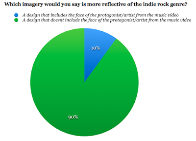

From this pie chart I was able to see that almost all of the people I asked within my target audience thinks that a design that doesn't include the face of the protagonist/artist from the music video would be the most reflective of my genre. This is good because this was the design that I was plaining on following throughout my digipak. However I might decide to include one or two images from my video just to make the cover slightly more interesting. 


This pie chart shows that my target audience all have different ideas for what colour scheme they think would be the most appropriate for an indie rock digipak. However the majority thought that black, white and red would be the most appropriate colour scheme. I have already decided that I want the background colour for my digipak to be black. Therefore I think that I will also use red and white font for it. I think that I should use the white font for any small print because it won't be as bold as the red and I want to vary the colours on the digipak so that it doesn't look dull. 


From this pie chart I have learnt that over half of the people I asked from my target audience would prefer to see a plain/simple design on my digipak. I think that this is a good idea because it will keep it minimalistic which is reflective of the genre and how it is more about the actual music. From my ideas I already planned to have a simple design for my digipak from looking at others for inspiration . Therefore this is reassuring to know that me and my target audience have the same ideas. 

What would you expect to see on a digipak/album?

For this question, I gained a range of responses. It was useful to find out what people expected to see because it meant that I could take note and make sure that I include it on my digipak. The things that people said were the general conventions found on digipaks, some of the examples included; band name, barcode, track/song list, album title, the record label/company and an image. 

Monday, 28 November 2016

Digipak Drawing

Isabelle has now completed the drawing for my album front cover. She sent me a picture when it has half finished in order to check that I was happy with the shape and design; which I was. We then arranged to meet up so that she could give it to me. This is a picture of the design:


I am very happy with the outcome of this drawing. It looks just how I envisioned it, I like how the lips have texture because it makes them looks more realistic. I have now scanned this drawing onto my computer, so that I can started editing it on photoshop. On photoshop, I plan to use the colour replacement tool in order to colour the lips in red. I will also probably enhance the colour of the teeth so that they stand out and look more realistic. I will also need to crop the scanned image in order to make sure that the the white background can not be seen on the digipak and will get rid of the marks that were on the paper . I have decided to use a black background for my digipak because it will suit the genre of the album and will also contrast with the colouring of the mouth in order to make it stand out further. 


Sunday, 27 November 2016

Digipak Questionnaire

I have decided to create a questionnaire in order to let me find out what my target audience thinks about digipaks in general and to help me narrow down some ideas for mu own digipak. I plan to give the questionnaire to at least 10-15 different people, who vary in age and gender so that I have a variety of answers that reflects the whole range of my target audience. I will then upload the responses/results to my blog to evaluate them.

Saturday, 26 November 2016

Digipak Front Cover Idea

I have decided that I am defiantly going to use an illustration/drawing on the front cover of my digipak. This is because I think it will make the cover stand out when on a shelve and will also allow the target audience to associate a direct image with the album which will make it more familiar to them. I have decided that I want to have a mouth as this illustration, this is because in my music video, I have quite a few close up shots on the actors mouth - this will help to show a clear link between the two products. I have been googling images, of hand drawn/animated mouths in order to get inspiration - this is a collection of them:


From doing this research I have decided that I particularly like how the mouth looks when it is biting the lip. I think that this would be a good illustration to have on my front cover because the pose is quite provocative which links well the the role of the female actor within my music video. I also like the use of the colouring because it gives the mouth more texture and makes it stand out further. Therefore I think that I will edit colour onto the mouth when it has been uploaded to photoshop.

As I am not very good at drawing, I decided to contact my friend Isabelle. Isabelle has always been good at drawing and is now studying art at collage. This means that she has experience in drawing and will be able to meet my request. I messaged isabelle telling her about what I wanted and if she was able to do this for me:


Isabelle has confirmed that she would be able to draw this for me, and will complete it as soon as she can. When I receive a copy of the drawing I will upload it to my blog.


Wednesday, 23 November 2016

Social Media Response: First Minute

I decided that I should contact my target audience via social media so that I could get their opinions on what I had for my music video so far. I thought that this would be helpful because they could then suggest some ideas for what footage I could put in my blank spaces. I sent them a link to the first drat alongside this message that:


These were the responses I received:


I have found this feedback very useful, my target audience agreed with me about the clip of the fishnet tights being too long. Therefore I am defiantly going to cut that down. They have given me some useful ideas about what I could use to fill up the blank spaces, so I am now going to experiment and see how different clips look. I will now start to re-edit the first minute of my music video, in order to make it the best that it can be.

Monday, 21 November 2016

Digipak Inspiration // Front Cover

Now that I have started the editing/post production process for my music video, I can start to think about the design of my digipak. I have been looking at digipaks released by artists from the indie rock genre, so that I can gain inspiration and ideas for my own. When looking through digipaks from the indie rock genre, there were a couple that stood out to me. These were;


(The Vaccines // What Did You Expect From The Vaccines?)


(Catfish and The Bottlemen // The Balcony)


(Arctic Monkeys // AM)

What stood out to me about these album covers, were their simplicity. The style that each of the covers followed was very minimalistic and simple, which meant that they weren't over the top. I also liked the fact that the artist/bands weren't on the covers because it was reflective of how their main focus is on the content they produce.
When designing my digipack front cover, I might draw ideas from each of these designs. Such as the layout or the colour scheme. I really like the use of the illustration on both the catfish and the Bottlemen album and the arctic monkeys album. Therefore I might come up with my own illustration idea which links with my album and band. I am going to create a questionnaire which I shall give out to people in my target audience to find out what they think of digipaks and what ideas of mine they like the best. I am also going to start to create a mood board of potential images that I could use throughout my digipak, some of these might be screenshots from the footage in my music video and others might be illustrations/sketches.

Wednesday, 9 November 2016

Social Media Responce: Artist Name Ideas

In order to get feedback about my artist name ideas, I got in contact with my target audience over social media. I asked them to pick their favourite name out of the options and explain why they chose this.


Here are the results that I received:


From this feedback I can see that my target audience generally like the band names with the word 'fossils' in. I think that I will combine elements of both of the names in order to create the band name, 'The Fossils'. I have decide upon this because the use of the word 'the' in a band name is very common within the indie rock genre and I think that this will highlight the bands genre to the target audience. I came up with the word fossils because I was inspired by the band name 'Blossoms'. I liked the natural element of the name and thought that it was good for the genre; therefore I started to think nature based words. The word fossils came to mind and I thought that it sounded cool because fossils can be unique and tell us about the past. I am happy with the decision to name my band, The Fossils' and think that it will be successful. Whilst I like the word 'iridescence' I don't think that it works as well with the indie rock genre as 'The Fossils'. However I think that the word could work in the album title. Therefore when coming up with album title names, I shall experiment with names involving the word 'iridescence'.