Showing posts with label Construction. Show all posts

Tuesday, 7 February 2017

Editing #4


When I began editing for my final draft I felt like one of the clips looked to similar to one that had already featured earlier on in the video. Before I decided to reverse the clip and slow it down. One slowed down I cropped the video so that it was just the actor looking directly into the camera instead of turning around. This made the clip look different to the earlier clip therefore making the video appear less repetitive.


I felt like this clip looked slightly awkward, therefore I decided to slow it down to make it seem somewhat sexier. I also darkened the clip as I found the lighting was too direct and looked particularly different to the rest of the clips. I did this using the 'convolution kernel' tool.

Digipak Final Products: Target Audience Feedback

I wanted to find out what my target audience thought of the digipak I created for the album 'Ultraviolet' by The Fossils. I sent them a link to the blog post displaying all of the products and then asked them to tell me what they thought of it and if there was anything in particular that they liked or disliked. These were the responses;


This feedback shows that my target audience generally like the outcome of my digipak. They like the simple style which I used and how I used it consistently throughout the whole of the digipak. In addition to this they like the colour scheme of red, black and white which I also used consistently throughout the digipak. There are only slight improvements that my target audience have recommended to me that I could improve, however overall I am happy with the outcome of the digipak and will not make any further adjustments/alterations to it.

Friday, 3 February 2017

Music Video Second Draft:Target Audience Feedback

After completing the second draft of my music video I decided to send the link of it to some people within my target audience to find out what they thought about my music video and if they thought there was anything that could be improved.


From this I can tell that my target audience really like the second draft of my music video. They fans of the use of overlapped clips and the range of colours that were used.They think that the lip syncing within my video could be slightly improved so for my final draft I will try and improve that.

Thursday, 2 February 2017

Music Video Second Draft


This is the second draft of my music video. There were a few errors which have occurred since exporting the video therefore I will need to go back and adjust them for my final draft. These errors include the fact the band names appears 8 seconds before the audio plays and that the hand overlay clip is larger than the rest of the footage. However I will still gain additional feedback on my video from my target audience so that I can find out what they think I could change and improve before my final draft. 

Magazine Advert: Target Audience Feedback

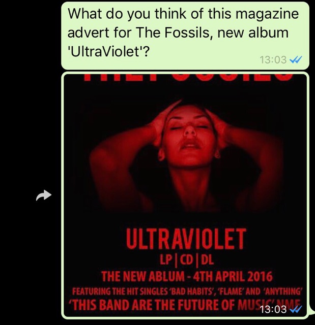
I decided that I wanted to gain feedback from my target audience so I could find out what they thought of the magazine advert. I sent out this message alongside the advertisement.


These are the responses I received:


This feedback shows that my target audience really like the outcome of my magazine advertisement. They agree that it looks professional and that the colour scheme works well. I have now noted the grammatical error on the front cover and will make sure to change that and update it so that it is even more professional.

Magazine Advert // First Draft


Wednesday, 1 February 2017

Magazine Advert Construction

In order to promote the band and their album, I have created a magazine advert which could feature in a range of music magazine. To start the creation of the advert, I opened up an A4 document on Adobe Photoshop. Then using the paint bucket tool, I coloured the whole page black.
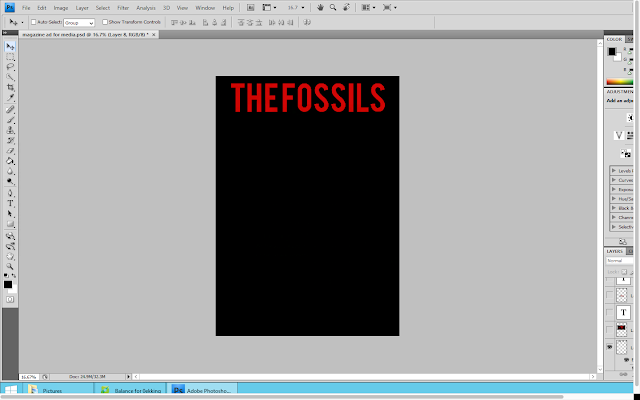
I then copied the bands name from the front cover of the digipak and pasted it onto the advert as a new layer. I used the free transform tool to adjust the size of the text as I wanted it to fill up the top of the advert.


I decided that I was going to use an image from the music video on this magazine advert. I thought that it would also be best to use one of these images which also featured on the digipak, in order to show that all of the products were connected/related. I opened up the image and pasted in onto this document as a new layer. I then used the free transform tool to adjust the size of the image. Once I was happy with the sizing of the image I moved the image so that it was below the bands name and that there was an equal amount of space either side of it.
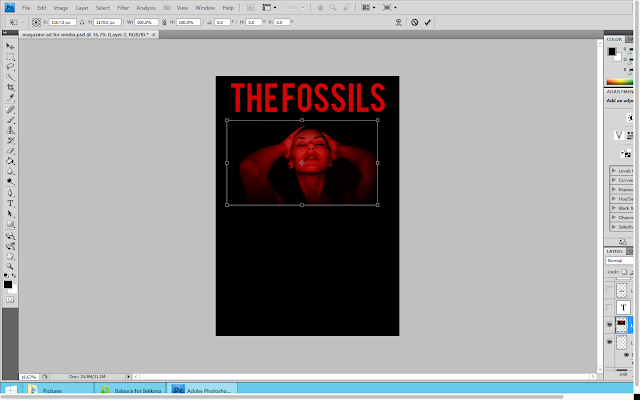


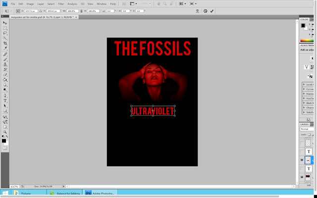
Below this image I placed the album name. Again I copied this from the digipak back cover to ensure that the font style and colour looked exactly the same. I again used the free transform tool to adjust the size of the text. However I decided to make this font smaller than the bands name as I feel as if it is more important to reinforce the bands name to the audience to make them appear as a brand.


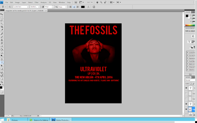
Using the text tool, I decided to type out some information about the album. This information included the options it is available on (CD and LP), the release date as well as some of the songs featured on the album. For this I used the same shade of red on the rest of the advert as well as across the whole digipak.


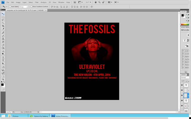
 In the bottom left hand corner I decided to put some other information about where the album would be available. I went onto google and saved the apple music logo. I then opened it on photoshop where  I pasted it as a new layer. I then moved it down to the bottom left hand corner and used the free transform tool to adjust the size of it.


Next to the apple music logo I then decided to the put record label logo. I used the same method to to this.
I felt as if there was a lot of blank space on the advert still so I decided to include some more information about the album. I used the text tool in order to type out an review quote from the music and lifestyle magazine NME. I continued to use the same font style and colour as the rest of the information.
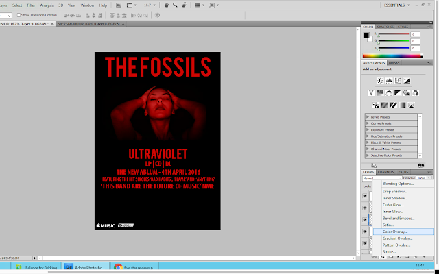


However I still felt as if there was too much blank space. Therefore I added a star review from another music magazine; Rolling Stone. I went onto google images and found a black PNG 5 Star Review. I saved this into my images and then opened in onto photoshop. When I pasted it onto photoshop, I used the colour overlay tool to make the stars the same colour as the rest of the text on the advertisement. I then used the free transform tool to adjust the size of the stars. When I was happy with their sizing, I positioned them centrally below the album review quote. Then below the stars I typed out who the review was from (Rolling Stone)
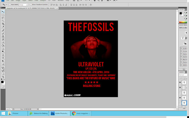


Finally, I wanted to add the website address for the band. So using the tex tool, I typed out the address matching the font style and colour to the rest on the page. I then placed this underneath the star review from rolling stone and made the font rather small to suggest that it wasn't particularly important.
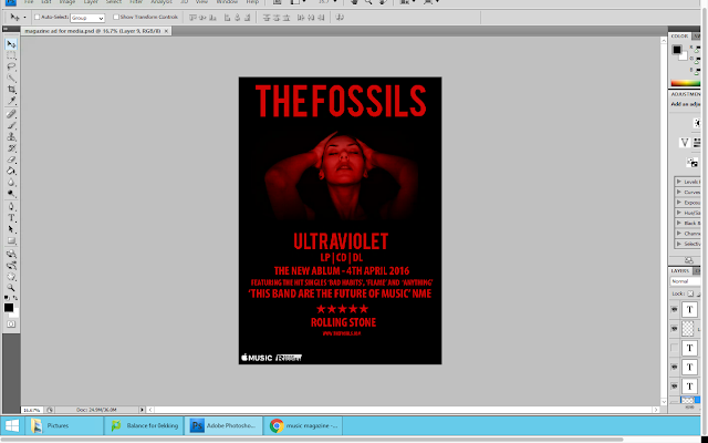


Overall I am happy with the outcome of my magazine advert. It remains reflective of the genre of the band and links well to both the music video and digipak thereby showing fluency between all of my products. I think that my advert looks realistic to other adverts and could actually be using in a magazine.

Tuesday, 24 January 2017

Digipak Inside Back Cover Construction

I decided that the inside of my digipak needed a back cover to go behind the CD. Therefore I decided to put some more information about the album and the band here. I continued the use of a square black background to match the rest of the digiapk.


I then used the text tool, in order to add a layer for me to type in the information. Some of information I included was about where the record was recorded, the band members and a 'thanks to'; I decided to include this information because when looking at digipaks I noticed that this is often included somewhere within the product. I also decided to centre the text so that it looked better on the page and filled the space up more efficiently.
Once I had all of the text typed out I pressed the tick in the tool bar in order to save the changes I had made. I then moved the text up slightly so that it was positioned in the centre of the back cover. However I felt like this was slightly too simple and that there was a lot of empty space. Therefore I decided to include the signatures of the bands members to make the digipak seem more personal. I used a website called 'my livesignature' in order to create and design 3 different signatures for each of the band members. Once I had designed each one I downloaded them and then opened them onto photoshop. From here I would select the signature using the select tool to copy the signature and the pasted in onto the back cover. I then had to right click on the layer and select blending options, this was to make the signature fonts white like the rest of the text on the page. From blending options, I selected the 'colour overlay' option and choose the colour white.


Once the signature colour was changed, I moved it down below the record information. I placed all three next to each other and used the free transform tool to change the sizes and angles of each signature to make them even more personal.


Overall I am happy with the inside back cover of my digipak. Most of this information isn't overly important and has already been mentioned else where on the digipak therefore I thought that this would work well for behind the CD. This is the final inside back cover of my digipak:

Monday, 23 January 2017

Digipak Inside Cover Construction

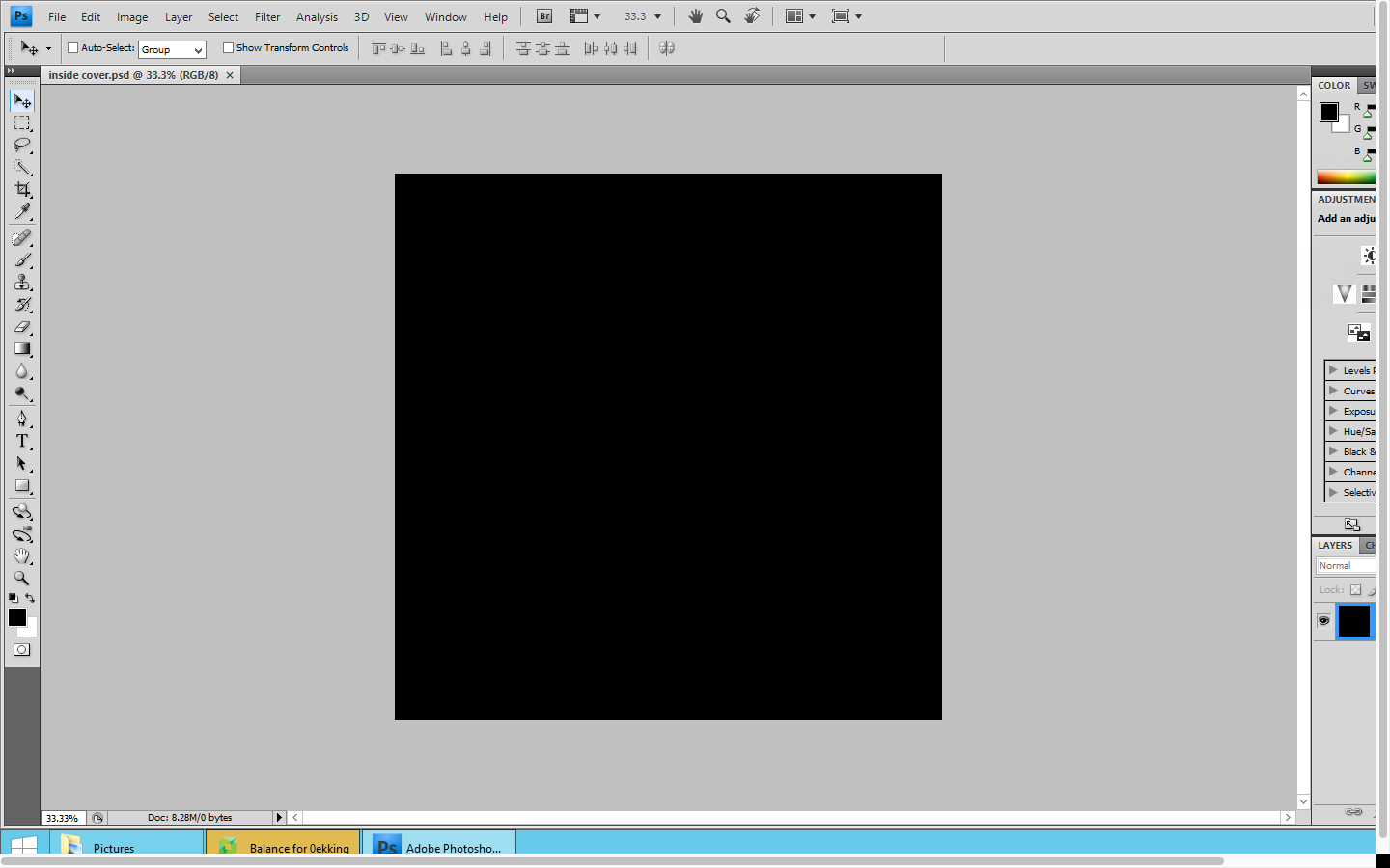
I decided that I wanted the inside of my digraph to follow the same simple and minimalistic style as the rest of the digipak. I first began by opening up a 60x60 blank square on photoshop so that it was the same size as both the front and back cover of the digipak. I then used the paint bucket tool in order to fill the page black to follow the same style as the rest of the digipak.
I then decided that I wanted to use another screenshot of the female actor from my music video on this inside cover. Therefore I decided to use one of the ones that decided not to use on my digipak back cover.  I opened this picture and then used the select tool to allow me to copy the image.


Once I had copied the image, I pasted it as a new layer onto the black inside cover. I then used the free transform tool to adjust the size and positioning of the image.

Once I was happy with the positioning of this image, I decided to add the product number that features on both the digipak spine and back cover. I used the same font style that I used for this information on the spine and back cover in order to show fluency. I positioned this text in the bottom right hand corner as overall it isn't particularly important to the inside cover of the digipak.


Overall I like the outcome of the digipak inside cover. I like the simple style as it doesn't distract from the rest of the products. I also like how it continues to follow the same style and colour scheme as the rest of the digipak whilst relating to my music video. This is the final draft of the inside cover of my digipak:

Wednesday, 18 January 2017

Music Video First Draft: Target Audience Feedback

I decided to show my target audience the first draft of my music video in order to find out what they thought about it. I asked them too tell me things that they liked and things that they didn't like/thought could be improved. These were the responses I received;

From this feedback, I have learnt that my target audience find my video engaging due to the fast pace shots and the range of colours used. However some did mention that they thought the footage used was occasionally repetitive. Because of this, I will go back to editing my first draft and change, remove and edit some of the clips in order to make it less repetitive. When doing this I will also check if the lip syncing is in time or if it needs to be slightly altered. 

Monday, 16 January 2017

Digipak CD

This is the first and final draft of the CD for my digipak. This is because I am happy with the outcome of the product and think that it continues following the minimalistic style as the rest of digipak. In addition to this, it looks realistic as it is comparable to other CD's found in digipaks.

CD Construction

To create the CD for digipak, I downloaded a template of a CD shape from google images. I then opened this template onto photoshop so that I could alter and adjust it to make it personal to my band.   I used the paint bucket tool, in order to fill in the majority of the CD black; this was to follow the same colour scheme as the rest of my digiapk.


I then copy and pasted the bands name from the digipak front cover onto the CD; this was to ensure that it was exactly the same. I then right clicked on the layer and selected 'blending options' from here I selected colour overlay and selected the same shade of red that I have been using throughout the construction of my digipak.


I continued the creation of the CD design, by adding text to the bottom of the disk. I used the same copyright information that was on the back cover of my digipak to show fluency. I then wanted to make the text curve along the bottom of the CD to make it look less obvious. To do this I had use the warp text tool. From here I selected the arc options to make it curve. 
I then copied the album title from the spine of the digipak and pasted it as a new layer onto the CD. I used the free transform tool in order to adjust the size of the text.
Below the album title, I decided to put the track list. This is because I thought it would be good to reinforce the track names to the audience. I used the same font colour and style for this in order to create fluency across the digipak.
I then added another text box onto the CD. I wanted to include the record company name and the product number. For this I used the same font that I used for the copyright information however I placed it above the bands name.