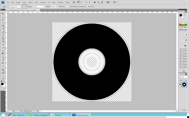
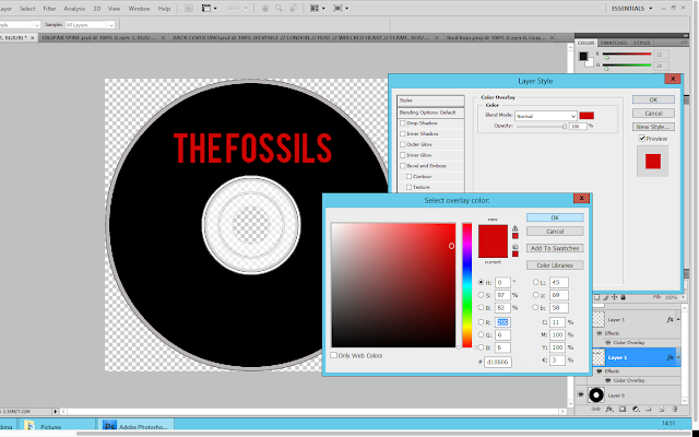
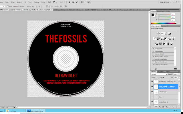
I then copy and pasted the bands name from the digipak front cover onto the CD; this was to ensure that it was exactly the same. I then right clicked on the layer and selected 'blending options' from here I selected colour overlay and selected the same shade of red that I have been using throughout the construction of my digipak.
I continued the creation of the CD design, by adding text to the bottom of the disk. I used the same copyright information that was on the back cover of my digipak to show fluency. I then wanted to make the text curve along the bottom of the CD to make it look less obvious. To do this I had use the warp text tool. From here I selected the arc options to make it curve.
I then copied the album title from the spine of the digipak and pasted it as a new layer onto the CD. I used the free transform tool in order to adjust the size of the text.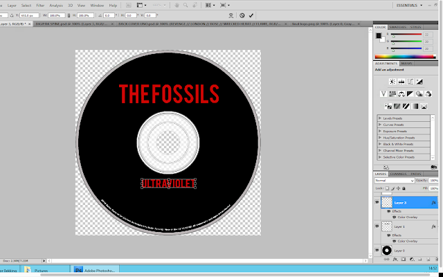 Below the album title, I decided to put the track list. This is because I thought it would be good to reinforce the track names to the audience. I used the same font colour and style for this in order to create fluency across the digipak.
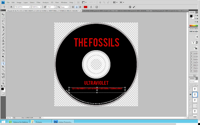 I then added another text box onto the CD. I wanted to include the record company name and the product number. For this I used the same font that I used for the copyright information however I placed it above the bands name.

No comments:
Post a Comment