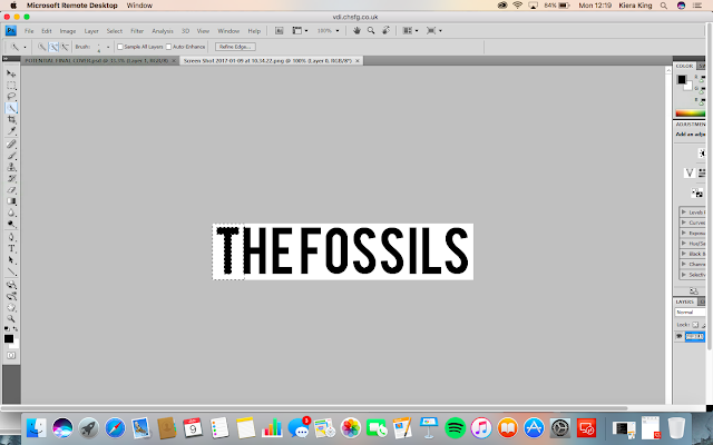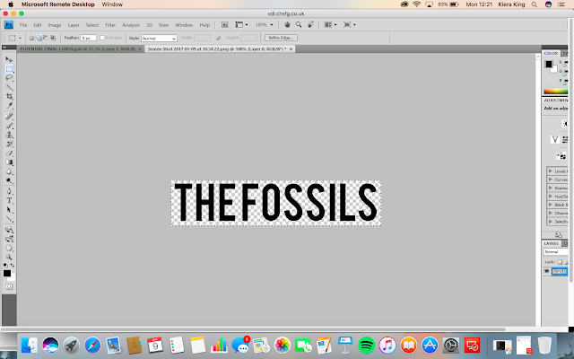
I used the magic wand selection tool in order to select the font so that I could remove the white background from it. By removing the white background, I am able to ensure that only the text will be pasted onto the new layer.

Once I had fully removed the white background I used the selection tool so that I could select the text and then copy and paste it onto the document where I was creating the front cover of the digipak.

Once I pasted the text onto this document, I right clicked on the layer and went on 'blending options' This then brought up a new tab which was about the styles of the layer. I then clicked on 'colour overlay'. This was to allow me to change the colour of the font so that it would match the colour scheme and stand out against the black background.
I then moved the font to a position above the lips and increased the size of it using the 'free transform' tool. Next, I wanted to increase the size of the lips because I felt like there was too much blank space. In order to do this, I clicked on the layer of the lips and used the 'free transform' tool. Whilst using this tool I held down the shift key on the keyboard to make sure that everything stayed in proportion.

No comments:
Post a Comment