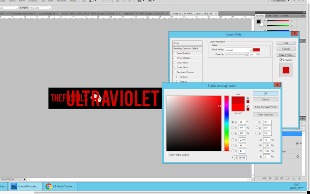
I then pasted the fonts for the band and album name onto the spine. However they pasted in black so I had to right click on each layer and the select blending options. From here I applied the same colour overlay as the fonts on the front and back of the digipak.
 Then using the free transformation tool, I adjusted the size of the fonts so that they were in better proportion with the size of the spine. I decided that I wanted to use the same image that was on the front cover of the digipak on the spine. Therefore I copy and pasted it as a new layer. I used the free transformation tool to make it smaller and then positioned it between the band and album name.
Finally, I added the release/product number to the spine. This is because when looking at digipaks I noticed that their spines all included the same number that was in their copyright information located at either the back of the digipak or on the CD. I used white font for this and a small font size in order to ensure that it wasn't the focus of the spine.
Here is the final spine:

Good work Kiera, your overall construction of your digipak is clear with obvious audience feedback.
ReplyDeleteCan you please upload your final first draft of your music video so I can see it plus you will need to gain audience feedback on that as well.
Keep blogging this is very good work
EJ
I really get pleasure from the kind of matters publish here. Appreciate it with regard to sharing us a terrific facts which is basically very helpful. Excellent day! Regards: Bobcat Attachments
ReplyDelete