
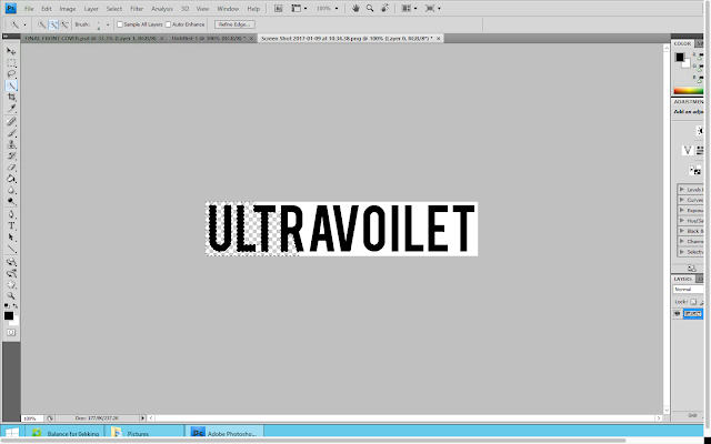
In a new tab, I opened up the album title 'Ultraviolet' which I got using 'dafont.com'. I then used the magic wand selection tool, in order to start removing the white background from the font. This would make the font have a transparent background that so it would look good on the black background of the digipak back.
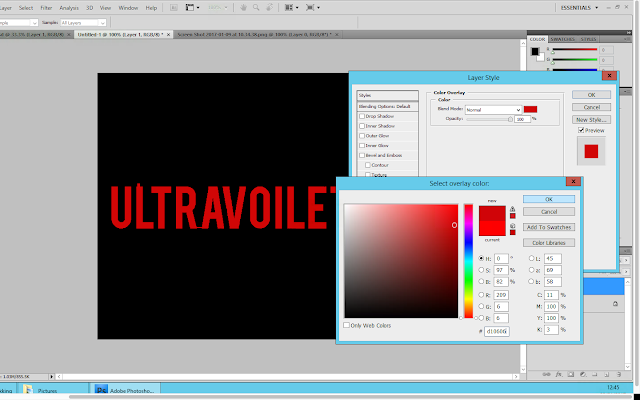
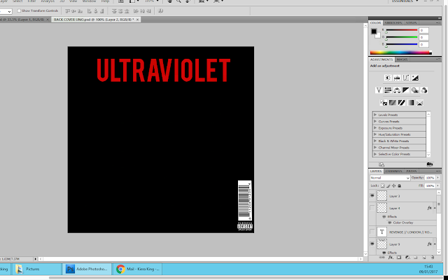
Once I had fully removed the background from the album title, I copied the text and then pasted it onto the back cover of my digipak as a new layer. I then right clicked on this layer and selected the option 'blending options'. From here I went to the option 'colour overlay' and changed the colour of the font to the same as the artists name on the front cover.
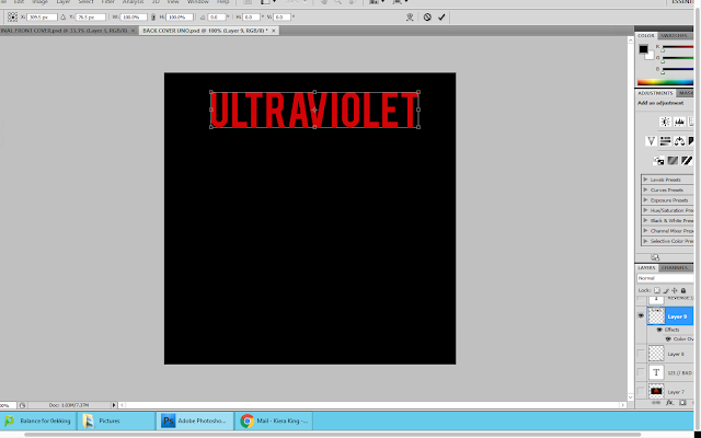
When I did this, I noticed that there were a few parts that the magic wand tool had missed. Therefore I used the rubber tool in order to erase them from the back cover. Using the free transform tool, I changed the size and position of the name title and placed it centrally at the top of the back cover.
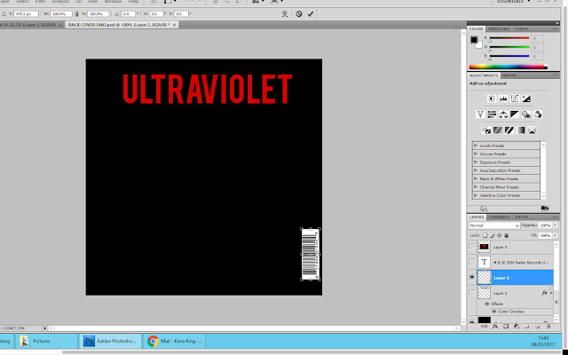
I then went onto google images and searched for 'CD barcode'. When I found the barcode I liked the most I saved the image into a folder. I then opened this image up on photoshop and copied and pasted it as a new layer onto the back cover of my digipak. I used the free transform tool to make the barcode smaller and rotate it. I then moved it the bottom right hand corner of the back cover.
I then did the same for the parental advisory logo; making sure it was the same width as the barcode. And I positioned it underneath the barcode.
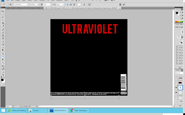
Across the bottom of the digipak back cover, I wanted to put the copy right information. Therefore I added a new layer so that I could type this information out. When doing this, I used a CD that I owned for reference to make sure I could make this information as accurate as possible in order to make my product professional. I used size 9 font for this information, because I didn't want it to stand out against the rest of the information that was going to be on the back cover.
No comments:
Post a Comment