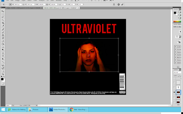
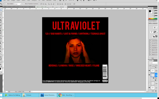
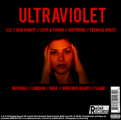
As I am still undecided on which image of the actor to use on the back cover of my digipak, I created 3 different digipak back covers; each using a different image. I did this, so that I can send them out to my target audience and find out which one they prefer and why. I opened the images onto photoshop and copied and pasted them as new layers on the digipack back cover. When it was pasted as a new layer I used the free transform tool, in order to adjust the size of the image so that it would fit in the middle of the back cover.

Once I was happy with the positioning of the image, I then moved on to adding the track list. I put the first 5 songs above the image and the last 5 songs below the image. I added a new layer and then used the text tool to allow me to type the song names. I decided to use two '//' between each song in order to make it clear that the songs were separate. I made sure to use the same colour font that I used for both the album title and band name in order to create consistency and fluency within my product.

After doing this, I decided to add the logo for the record company I created 'Radar Records'. From looking at actual digipaks, I found that this was a common convention. Like before, I opened up the logo on photoshop and then copy and pasted it as a new layer on the back cover of my digipak. Using the free transform tool, I adjusted the size of the logo and then moved it next to the barcode.

No comments:
Post a Comment