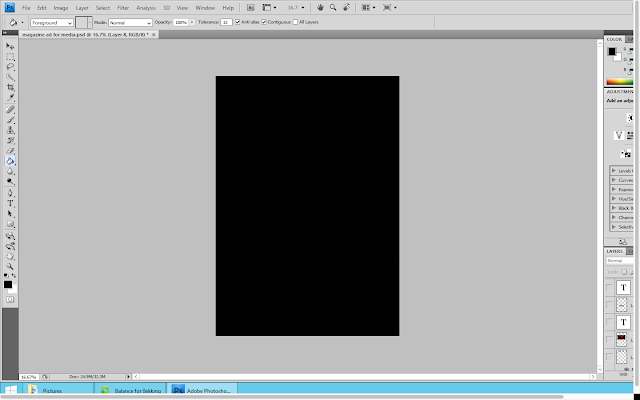
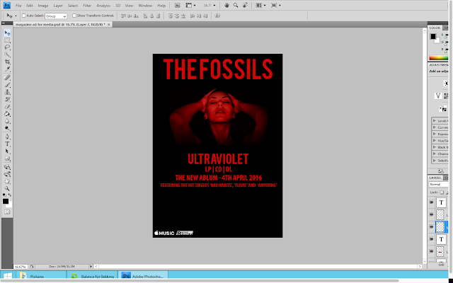
I then copied the bands name from the front cover of the digipak and pasted it onto the advert as a new layer. I used the free transform tool to adjust the size of the text as I wanted it to fill up the top of the advert.
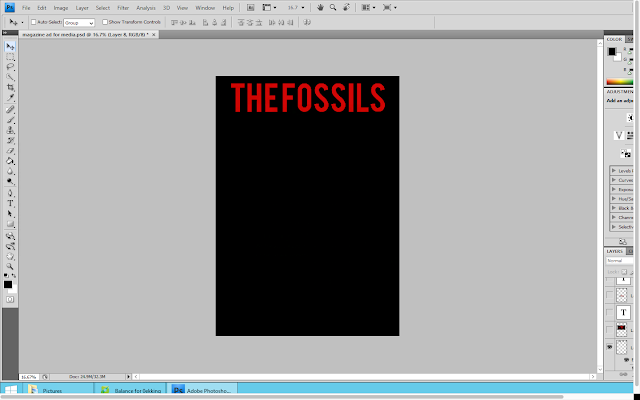
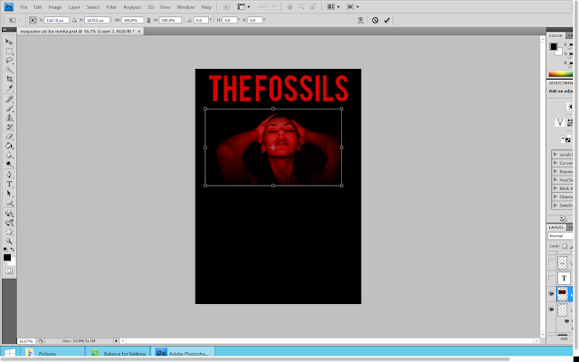
I decided that I was going to use an image from the music video on this magazine advert. I thought that it would also be best to use one of these images which also featured on the digipak, in order to show that all of the products were connected/related. I opened up the image and pasted in onto this document as a new layer. I then used the free transform tool to adjust the size of the image. Once I was happy with the sizing of the image I moved the image so that it was below the bands name and that there was an equal amount of space either side of it.
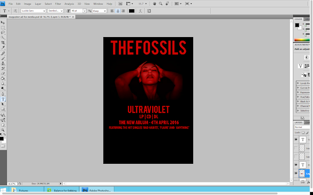
Below this image I placed the album name. Again I copied this from the digipak back cover to ensure that the font style and colour looked exactly the same. I again used the free transform tool to adjust the size of the text. However I decided to make this font smaller than the bands name as I feel as if it is more important to reinforce the bands name to the audience to make them appear as a brand.

Using the text tool, I decided to type out some information about the album. This information included the options it is available on (CD and LP), the release date as well as some of the songs featured on the album. For this I used the same shade of red on the rest of the advert as well as across the whole digipak.
In the bottom left hand corner I decided to put some other information about where the album would be available. I went onto google and saved the apple music logo. I then opened it on photoshop where I pasted it as a new layer. I then moved it down to the bottom left hand corner and used the free transform tool to adjust the size of it.

Next to the apple music logo I then decided to the put record label logo. I used the same method to to this.
I felt as if there was a lot of blank space on the advert still so I decided to include some more information about the album. I used the text tool in order to type out an review quote from the music and lifestyle magazine NME. I continued to use the same font style and colour as the rest of the information.
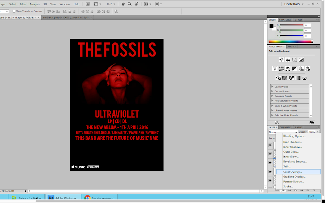
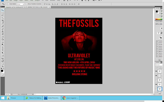
However I still felt as if there was too much blank space. Therefore I added a star review from another music magazine; Rolling Stone. I went onto google images and found a black PNG 5 Star Review. I saved this into my images and then opened in onto photoshop. When I pasted it onto photoshop, I used the colour overlay tool to make the stars the same colour as the rest of the text on the advertisement. I then used the free transform tool to adjust the size of the stars. When I was happy with their sizing, I positioned them centrally below the album review quote. Then below the stars I typed out who the review was from (Rolling Stone)
Finally, I wanted to add the website address for the band. So using the tex tool, I typed out the address matching the font style and colour to the rest on the page. I then placed this underneath the star review from rolling stone and made the font rather small to suggest that it wasn't particularly important.
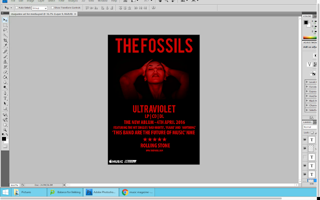
Overall I am happy with the outcome of my magazine advert. It remains reflective of the genre of the band and links well to both the music video and digipak thereby showing fluency between all of my products. I think that my advert looks realistic to other adverts and could actually be using in a magazine.
No comments:
Post a Comment