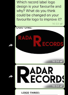
These were the replies:
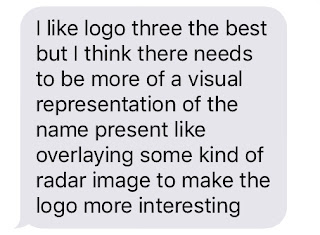
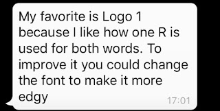
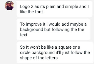
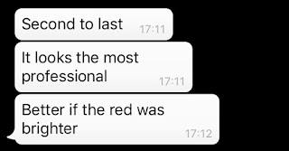
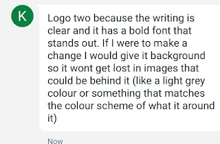
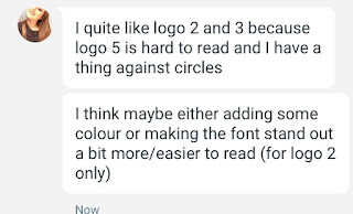
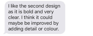

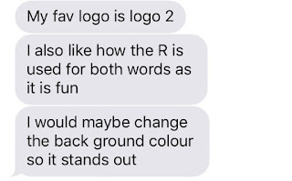
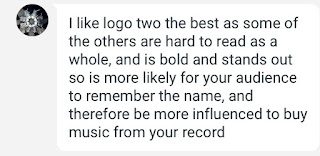
From this feedback I can see that my target audience generally prefer the second logo design. This is because it is simple and easier to read. However they did recommend that I made small adjustments to the colour of the background in order to make the font stand out more. I agree with my target audience and will therefore listen to their feedback and change my logos design accordingly.

No comments:
Post a Comment