Sunday 4 December 2016

Editing #3

I have continued to edit the final minute of my music video on premier pro in order to create my first draft. Throughout the editing process, I have been using similar tools and effects in order to show fluency within my video.

 For this section of the video, I layer two clips of the different actors over one another; this was because I wanted layering to be a consistent theme within my video. However on one of the clips, I used the zoom transition so that the clip of the male singer would end up being the only one within the shot. This was to show that he was the main actor within the video - it also fitted well with the music.


There was a section of music where it began to slow down in pace slightly, therefore I wanted the footage to match the pace. To do this I changed the speed of specific clips so that they were slowly and less 'jumpy'.

Friday 2 December 2016

Digipak Track List Research

I decided to look at the track listing for some albums by indie rock artists so that I could could an idea of the amount of songs bands usually include on their albums as well as what they name them.


I found that generally the albums tend to have around 10-12 songs which vary in length. From this information I decided to create an online poll so that I could find out how many tracks my target audience would like to see on my digipak. I created my poll online using a website called 'poll everywhere'. I then sent the link to people using social media and instant text messaging.


I sent this poll link out to 15 people, and these were the results:


From the results I can tell that my target audience would expect to see 9-11 songs on a digipak. This happens to be reflective of the research that I conducted into already existing indie rock albums. Because of this, I am going to include at least 11 songs on my digipak. I now need to come up with some names for them. Therefore I am going to research indie rock songs and see what they generally are called in order to make mine as similar to the conventions of the genre as possible.

Thursday 1 December 2016

First Draft // Digipak Front Cover

This is the first draft of my digipak. Overall I am happy with the outcome of this, but I am not entirely sure if I am happy with the text on the page. I feel like it looks a bit strecthed out even though it inst. Therefore I am going to send this image to my target audience on social media to find out what they think of it and if they think that there is anything I could improve on/change. 


Digipak Front Cover Construction #2

I have continued the creating the front cover of my digipak. I decided to only add the band name on the front of my cover because of the response from target audience in the digipak questionnaire.


To add the band name to my front cover, I added a new layer and applied the text tool. I dragged the text box over the middle of the drawing in the center of my cover. I used the same font that I used in my music video in order to show consistency/fluency between my products. I also made it the same colour.


I noticed that that wasn't the exact same font, then I realized that it was because I made the font in my music video 'bold condensed italic'. Therefore I changed this on photoshop to make it the same. I then pressed the tick in order to apply this and then that was the first draft of my digipak!

Wednesday 30 November 2016

Digipak Questionnaire Results

After giving my digipak questionnaire to 10 people I calculated the results and decided that it would be best to turn the answers into pie charts so that I could easily analyse the results.


This pie chart shoes that when purchasing a CD the majority of my target audience actively look for the band name. This is probably because they are unlikely to buy a CD without knowing who the band is and I can also relate to this. When buying a CD the people I asked didn't look for an album name or bonus material - this suggests that my target audience isn't interested in these features/conventions. From this information, I have decided that I should definitely make sure that the band name is frequently used across the digipak. I will probably use it on the front cover, the CD and the spine - this will ensure that it can be seen. 


From this pie chart I was able to see that almost all of the people I asked within my target audience thinks that a design that doesn't include the face of the protagonist/artist from the music video would be the most reflective of my genre. This is good because this was the design that I was plaining on following throughout my digipak. However I might decide to include one or two images from my video just to make the cover slightly more interesting. 


This pie chart shows that my target audience all have different ideas for what colour scheme they think would be the most appropriate for an indie rock digipak. However the majority thought that black, white and red would be the most appropriate colour scheme. I have already decided that I want the background colour for my digipak to be black. Therefore I think that I will also use red and white font for it. I think that I should use the white font for any small print because it won't be as bold as the red and I want to vary the colours on the digipak so that it doesn't look dull. 


From this pie chart I have learnt that over half of the people I asked from my target audience would prefer to see a plain/simple design on my digipak. I think that this is a good idea because it will keep it minimalistic which is reflective of the genre and how it is more about the actual music. From my ideas I already planned to have a simple design for my digipak from looking at others for inspiration . Therefore this is reassuring to know that me and my target audience have the same ideas. 

What would you expect to see on a digipak/album?

For this question, I gained a range of responses. It was useful to find out what people expected to see because it meant that I could take note and make sure that I include it on my digipak. The things that people said were the general conventions found on digipaks, some of the examples included; band name, barcode, track/song list, album title, the record label/company and an image. 

First 2 Minutes Draft

I have now completed the first 2 minutes of my music video. I have made some slight alterations to the first minute of the video because I wasn't completely happy with all of the clips and the colours used. For example the green filter that I used for the first 'bad habits' therefore I decided to change it to blue. When editing this extra minute I needed to go through more of my footage in order to find more usable clips because I didn't want to repeat the clips other than in the chorus. I more or less used the same footage for the chorus to show consistency within my video, however I did change it slightly: used some new footage in order to mix it up a bit. I am happy with how my video is coming along so far and will hopefully have a final first draft of my music video completed soon. 

Editing #2

I am still editing my music video using Adobe Premier Pro. I have now edited around 2 minutes worth of footage which means that I only have 1 minute left to edit!


When editing my video, I used a clip which showed the actor lip-syncing at his side profile. However I didn't like the fact that there was a lot of empty space on the other side of him. Therefore I decided to copy the clip, flip it horizontally and layer it on top of the other clip. However at first this couldn't be seen; so I then had to change the opacity of one of the layers so that it was lower. This then allowed for both clips to be seen at the same time. I like the effect of this because it makes it look as if the artist is singing at himself and it makes the footage more engaging and interesting.


I decided that I wanted to use some transitions in my video to make the footage more interesting. I clipped the transition 'gradient wipe' to the clip just before the chorus started. I thought that this would a good place to put the transition as it almost portrayed the move from the verse to the chorus. I made the transition shorter because I wanted to make sure that it still went in time with the pace of the song like the rest of the footage.


When filming my video I knew that in the guitar solo I wanted to layer different clips of the same section over one another, therefore I filmed it at different zoom lengths. I then did this on Adobe Premier Pro, however I found that it wasn't particularly noticeable what I had done. Therefore I decided to add colour tints to the footage and make each one a different colour so that they would stand out. I add the tint option to each clip and chose red, black, black and white as well as green. Im happy with the outcome of this because it highlights the different layers of footage and also makes the video more eye-catching.

Tuesday 29 November 2016

Digipak Front Cover Construction #1

After receiving the drawing of the mouth, I had started working on the construction of the front cover for my digipak. I am using photoshop to design my digipak because I have used it before and am confident with how to use it.

I first opened the scanned image onto photoshop, from which I decided to crop it down to a smaller scale so that it would be easier for me to remove the background.

After cropping the image, I used the magic wand tool to get rid of the white background surrounding the mouth. I struggled with getting this smooth because of the shape of the drawing; the edges weren't clearly defined which meant that it would keep trying to select the wrong parts to get rid of. However using the 'alt' key I was able to change the selection to make it more specific. 


Once I had got rid of the white background completely I opened up a new tab. This was to allow me to create the background for my front cover. I used the dimensions 60cmX60cm in order to get the perfect square shape.

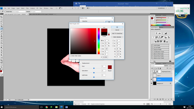
This then opened up a square document for me to work with. Because I wanted the background to be all black I used the pain bucket tool in order to completely change the colour. Once this was complete, I went back to the other tab with the drawing of the mouth and used the select tool to copy the image so that I could then paste it onto the black background. After this, I decided to change the colour of the lips. I went on image and then to adjustments. From here I went down to the 'colour replace' tool. This then opened up a new window, which allowed me to pick the colour that I wanted to use - I chose red. I applied this and then went to the paintbrush tool so that I could start to colour in the mouth. I zoomed in on it so that I could make sure I didn't miss any sections. 

Once I was happy with the colour, I decided that I wanted to have the lips at a higher contrast in order to make them stand out further. Therefore I adjusted the contrast and brightness of the layer to make them appear more vivid. I was happy with the outcome of this as it made the colours in the image a lot bolder. 


When looking at the image I was generally very happy with the outcome, however I felt like a few things needed adjusting. I decided to go over the teeth with white using the paintbrush, this was to make the more vibrant and less grey looking. I also used the rubber tool so that I could go around the edges of the lips and make the smoother. 

Now that I have got the image on my digipak, I need to add the artist name to the cover also. I plan to use the same font for my artist name that was used in my music video in order to show consistency between the two products. I have decide not to include the album name on the front of my digipak. This show how I am going against the conventions. I have decided to do this because I want the over to follow a minimalistic style and not look crowded. Therefore I am going to include the album name of the spine and back of the digipak . 

Monday 28 November 2016

Digipak Drawing

Isabelle has now completed the drawing for my album front cover. She sent me a picture when it has half finished in order to check that I was happy with the shape and design; which I was. We then arranged to meet up so that she could give it to me. This is a picture of the design:


I am very happy with the outcome of this drawing. It looks just how I envisioned it, I like how the lips have texture because it makes them looks more realistic. I have now scanned this drawing onto my computer, so that I can started editing it on photoshop. On photoshop, I plan to use the colour replacement tool in order to colour the lips in red. I will also probably enhance the colour of the teeth so that they stand out and look more realistic. I will also need to crop the scanned image in order to make sure that the the white background can not be seen on the digipak and will get rid of the marks that were on the paper . I have decided to use a black background for my digipak because it will suit the genre of the album and will also contrast with the colouring of the mouth in order to make it stand out further. 


Sunday 27 November 2016

Digipak Questionnaire

I have decided to create a questionnaire in order to let me find out what my target audience thinks about digipaks in general and to help me narrow down some ideas for mu own digipak. I plan to give the questionnaire to at least 10-15 different people, who vary in age and gender so that I have a variety of answers that reflects the whole range of my target audience. I will then upload the responses/results to my blog to evaluate them.

Saturday 26 November 2016

Digipak Front Cover Idea

I have decided that I am defiantly going to use an illustration/drawing on the front cover of my digipak. This is because I think it will make the cover stand out when on a shelve and will also allow the target audience to associate a direct image with the album which will make it more familiar to them. I have decided that I want to have a mouth as this illustration, this is because in my music video, I have quite a few close up shots on the actors mouth - this will help to show a clear link between the two products. I have been googling images, of hand drawn/animated mouths in order to get inspiration - this is a collection of them:


From doing this research I have decided that I particularly like how the mouth looks when it is biting the lip. I think that this would be a good illustration to have on my front cover because the pose is quite provocative which links well the the role of the female actor within my music video. I also like the use of the colouring because it gives the mouth more texture and makes it stand out further. Therefore I think that I will edit colour onto the mouth when it has been uploaded to photoshop.

As I am not very good at drawing, I decided to contact my friend Isabelle. Isabelle has always been good at drawing and is now studying art at collage. This means that she has experience in drawing and will be able to meet my request. I messaged isabelle telling her about what I wanted and if she was able to do this for me:


Isabelle has confirmed that she would be able to draw this for me, and will complete it as soon as she can. When I receive a copy of the drawing I will upload it to my blog.


Thursday 24 November 2016

1 Minute Final Draft

I have now completed the first minute of my music video. I am quite happy with how it has turned out so far, from the first draft I could see what I did and didn't like about the music video. Therefore I have now changed it so that both me and my target audience are happy with the outcome. I have applied the colour filters across the the majority of the clips - I felt like some of them looked better without any colour. The colours I used where the ones which were suggested to me by my target audience. I will now continue to edit the next minute of my music video.


Wednesday 23 November 2016

Social Media Response: First Minute

I decided that I should contact my target audience via social media so that I could get their opinions on what I had for my music video so far. I thought that this would be helpful because they could then suggest some ideas for what footage I could put in my blank spaces. I sent them a link to the first drat alongside this message that:


These were the responses I received:


I have found this feedback very useful, my target audience agreed with me about the clip of the fishnet tights being too long. Therefore I am defiantly going to cut that down. They have given me some useful ideas about what I could use to fill up the blank spaces, so I am now going to experiment and see how different clips look. I will now start to re-edit the first minute of my music video, in order to make it the best that it can be.

Tuesday 22 November 2016

First Minute

I have now edited the first minute of my music video. There are still some blank spaces because I am currently not sure what to put in these sections. From watching this a couple of times, I have decided that there are somethings that I would like to change about what I have completed so far. For example, the tilt shot of the actresses legs, I think that this shot is too long and therefore I plan to trim it down. I also still need to work on some of the colour filters within my music video. When I have completely finished the first minute of the video, I will upload it again and compare the two products.


Monday 21 November 2016

Digipak Inspiration // Front Cover

Now that I have started the editing/post production process for my music video, I can start to think about the design of my digipak. I have been looking at digipaks released by artists from the indie rock genre, so that I can gain inspiration and ideas for my own. When looking through digipaks from the indie rock genre, there were a couple that stood out to me. These were;


(The Vaccines // What Did You Expect From The Vaccines?)


(Catfish and The Bottlemen // The Balcony)


(Arctic Monkeys // AM)

What stood out to me about these album covers, were their simplicity. The style that each of the covers followed was very minimalistic and simple, which meant that they weren't over the top. I also liked the fact that the artist/bands weren't on the covers because it was reflective of how their main focus is on the content they produce.
When designing my digipack front cover, I might draw ideas from each of these designs. Such as the layout or the colour scheme. I really like the use of the illustration on both the catfish and the Bottlemen album and the arctic monkeys album. Therefore I might come up with my own illustration idea which links with my album and band. I am going to create a questionnaire which I shall give out to people in my target audience to find out what they think of digipaks and what ideas of mine they like the best. I am also going to start to create a mood board of potential images that I could use throughout my digipak, some of these might be screenshots from the footage in my music video and others might be illustrations/sketches.

Sunday 13 November 2016

Editing

I have started to edit my music video using the software 'Adobe Premier Pro'. As I have never used this software before, it is taking me a little while to get used to it, however I am starting to feel more comfortable with the software. I have edited around 30 seconds of the music video, however there are some blank spaces because I am not sure what to footage to put there yet.


My music video opens with a title page which states the bands name. I have adjusted the font style, colour and size in order to make it reflective of the indie rock genre. I have also used the same style for the next title which comes in shortly after; this title says the name of the song. I wanted to use the same style in order to create consistency and fluency in my music video.


When filming, I decided that I wanted to edit the colour filters on top of my footage during the production process. I have now learnt how to this; I clicked on video effects and then searched for 'Tint'. I then dragged the effect onto the footage, this then enabled me to select a colour of my choice and apply it to the footage. Whilst I plan to experiment with the colours in the music video, I want to make sure that if the same colour reappears in the video that it is exactly the same. Therefore I will make not of the colour name/code when editing so that I can easily do this.


Wednesday 9 November 2016

Social Media Responce: Artist Name Ideas

In order to get feedback about my artist name ideas, I got in contact with my target audience over social media. I asked them to pick their favourite name out of the options and explain why they chose this.


Here are the results that I received:


From this feedback I can see that my target audience generally like the band names with the word 'fossils' in. I think that I will combine elements of both of the names in order to create the band name, 'The Fossils'. I have decide upon this because the use of the word 'the' in a band name is very common within the indie rock genre and I think that this will highlight the bands genre to the target audience. I came up with the word fossils because I was inspired by the band name 'Blossoms'. I liked the natural element of the name and thought that it was good for the genre; therefore I started to think nature based words. The word fossils came to mind and I thought that it sounded cool because fossils can be unique and tell us about the past. I am happy with the decision to name my band, The Fossils' and think that it will be successful. Whilst I like the word 'iridescence' I don't think that it works as well with the indie rock genre as 'The Fossils'. However I think that the word could work in the album title. Therefore when coming up with album title names, I shall experiment with names involving the word 'iridescence'.

Tuesday 8 November 2016

Artist Name Ideas

Below is a brainstorm of possible name ideas for my indie rock/alternative band. I gained inspiration for these names by flicking through a dictionary and selected words that stood out to me. I also gained inspiration from bands that already existed as well as songs titles which I like such as 'Walking Disasters'. This brainstorm has allowed me to visually see my ideas. I am currently not sure what name I like the most. I think that my favourite names are; Fossils, The Walking Illusions, The Magic Shadows, The Infusion, The Lost Fossils and Iridescence. As I am unable to decided which is my favourite, I am going to ask my target audience via social media what their favourite band name is and why. This should help me come to a conclusion on which name I should use.

Monday 7 November 2016

Storyboard

As I have now gone through all of the footage, I decided to create a storyboard to help me when it comes to editing my music video. I decided to create this storyboard for the first 40 seconds of my music video; if I find this helpful, I will consider making storyboards for the rest of the music video. In each box, I drew a small sketch of what the clip I would be using and then wrote down the duration that it would be shown for; I also added a brief description of what the image was showing just to make it clear. There was one section of the song that I could not decide what to put for it; therefore when editing I shall leave that section blank and consult my target audience to find out what they think I should put there. I shall only be using the storyboard as a guide, therefore the placement of certain clips might actually change when I start editing the music video.


Saturday 5 November 2016

4/11/16 FOOTAGE

I have now looked through all of the footage that has been recorded over the 4 days of filming. From the final day of filming (4/11/16) I felt like the majority of the footage that I got would have been usable, this is because I already was aware of what did and didn't work. I had also already planned specific shots and movements that I want the actor do to and we had practiced them before when we did the makeup and outfit planning. Therefore for this compilation, I have just selected the very best footage.


Friday 4 November 2016

3/11/16 FOOTAGE

I have started to look through the final footage of filming with Jonathan on November 3rd. I think that this was the most successful day of filming with this actor, because I had figured out what did and didn't work. I also had corrected the previous issue that I had experienced with the lighting and the strobe light. Therefore I am happy with the footage that was recorded that day. I have made a compilation of all of the footage that I think I could potentially use for my music video and I have put the clip name and the time frame so that I can easily reference it when it comes to editing my final music video.


I have also done the same compilation of the footage that I deemed unusable. Because this day of filming went much smoother than previous days, I found that there was less footage that was completely unusable. There is one clip with the guitar, where I tried to use the acetate over the camera lens again. However because of the lighting change it just caused glare on the paper which ruined the footage; therefore making it unusable. I also had a slight issue with focusing the camera, however therefore wasn't as much in comparison to the first day of filming. The camera mainly found it difficult to focus when I changed the zoom lengths, however it was only out of focus for a short amount of time whilst it readjusted to the new length.

Costume Change

I have decided to change the costume for Actor 2 in my music video. My original plan/idea was to use two different outfits. I was going to do a casual outfit consisting of a black halterneck and black skinny jeans. I was then going to get the actor to change into a black dress and fishnet tights. Upon further thought, I decided that I didn't like this idea anymore because I thought that it would make the footage look quite jumpy between cuts. Therefore I decided to combine the 2 ideas. I got the model to wear the black halterneck with a skirt and the fishnet tights. I wanted to use the fishnet tights because I wanted to tilt up the actors legs for the lyrics 'thigh high'. This was her final outfit:


Filming 4/11/16 - BEHIND THE SCENES

Below I have inserted some pictures of Josie that I took during the filming process. They show the actor as well as my filming set up; showing all of the equipment that I used.


As this was the last day of filming I already knew the equipment setup and what did and didn't work. This made the production process a lot smoother and easier. I decided to use a black sheet on the background for this day of filming because it meant that I could experiment with different zoom lengths because I wasn't limited by the gaps between the background that I had been using. Overall I am happy with the footage that was recorded today and think that most of it will be usable in my music video. 
Below are some stills from the footage that I got today.