Wednesday, 18 January 2017

Music Video First Draft: Target Audience Feedback

I decided to show my target audience the first draft of my music video in order to find out what they thought about it. I asked them too tell me things that they liked and things that they didn't like/thought could be improved. These were the responses I received;

From this feedback, I have learnt that my target audience find my video engaging due to the fast pace shots and the range of colours used. However some did mention that they thought the footage used was occasionally repetitive. Because of this, I will go back to editing my first draft and change, remove and edit some of the clips in order to make it less repetitive. When doing this I will also check if the lip syncing is in time or if it needs to be slightly altered. 

Monday, 16 January 2017

Digipak CD

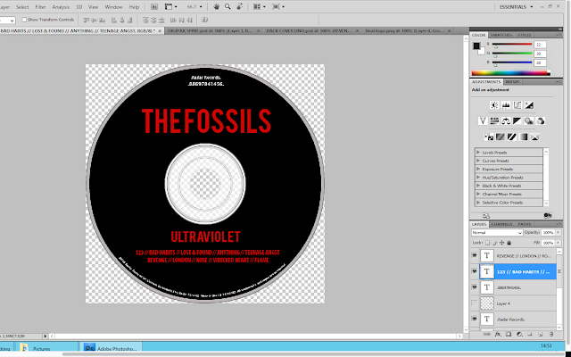
This is the first and final draft of the CD for my digipak. This is because I am happy with the outcome of the product and think that it continues following the minimalistic style as the rest of digipak. In addition to this, it looks realistic as it is comparable to other CD's found in digipaks.

CD Construction

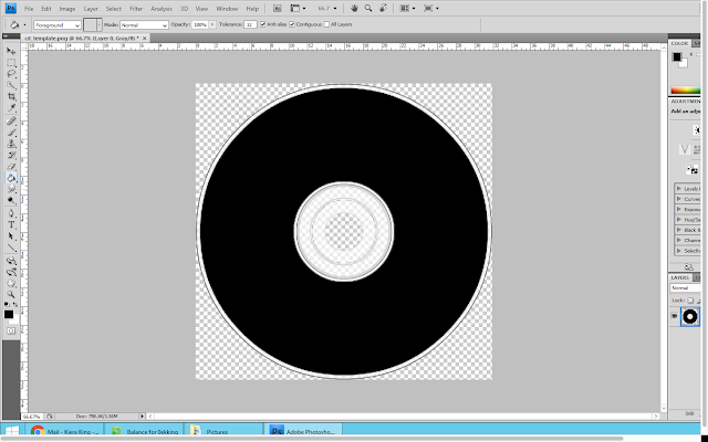
To create the CD for digipak, I downloaded a template of a CD shape from google images. I then opened this template onto photoshop so that I could alter and adjust it to make it personal to my band.   I used the paint bucket tool, in order to fill in the majority of the CD black; this was to follow the same colour scheme as the rest of my digiapk.

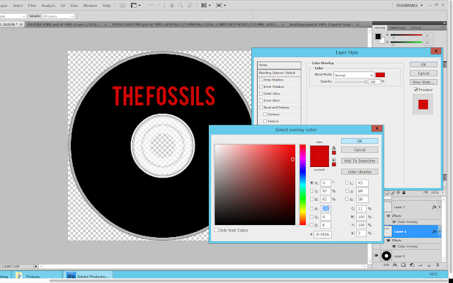
I then copy and pasted the bands name from the digipak front cover onto the CD; this was to ensure that it was exactly the same. I then right clicked on the layer and selected 'blending options' from here I selected colour overlay and selected the same shade of red that I have been using throughout the construction of my digipak.

I continued the creation of the CD design, by adding text to the bottom of the disk. I used the same copyright information that was on the back cover of my digipak to show fluency. I then wanted to make the text curve along the bottom of the CD to make it look less obvious. To do this I had use the warp text tool. From here I selected the arc options to make it curve. 
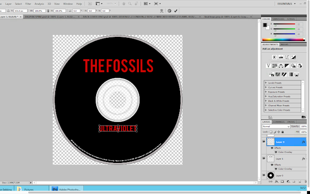
I then copied the album title from the spine of the digipak and pasted it as a new layer onto the CD. I used the free transform tool in order to adjust the size of the text.
Below the album title, I decided to put the track list. This is because I thought it would be good to reinforce the track names to the audience. I used the same font colour and style for this in order to create fluency across the digipak.
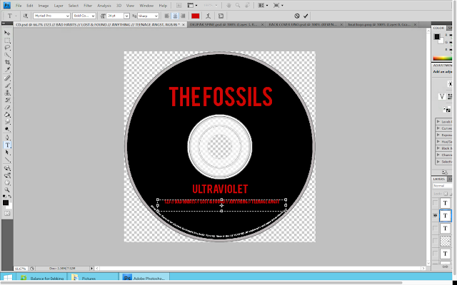
I then added another text box onto the CD. I wanted to include the record company name and the product number. For this I used the same font that I used for the copyright information however I placed it above the bands name.

Music Video First Draft

This is the first draft of my music video. I am overall quite happy with the outcome however there are still some alterations which I will need to make. I have decided that I will show the first draft to members of my target audience so that I can their thoughts and feedback on what they like and dislike about my video.


Monday, 9 January 2017

Digipak Spine Construction

To create the spine for my digipak I used the same fonts that I used on the front and back covers of the digipak. I copied them from those documents and then pasted them as new layers onto the spine. I firstly used the paint bucket tool to make the spine black like the rest of the digipak.


I then pasted the fonts for the band and album name onto the spine. However they pasted in black so I had to right click on each layer and the select blending options. From here I applied the same colour overlay as the fonts on the front and back of the digipak.
Then using the free transformation tool, I adjusted the size of the fonts so that they were in better proportion with the size of the spine. I decided that I wanted to use the same image that was on the front cover of the digipak on the spine. Therefore I copy and pasted it as a new layer. I used the free transformation tool to make it smaller and then positioned it between the band and album name.


Finally, I added the release/product number to the spine. This is because when looking at digipaks I noticed that their spines all included the same number that was in their copyright information located at either the back of the digipak or on the CD. I used white font for this and a small font size in order to ensure that it wasn't the focus of the spine.

Here is the final spine:


Final Digipak Back Cover

After receiving feedback from my target audience I decided what image I wanted to use on my front cover. Once this was decided, I then began to move everything down slightly so that there was less blank space between the copyright information and the last 5 songs on the track list. Overall I like the outcome of the digipak back cover. I think that it works well with the digipak front cover and is reflective of the indie rock genre; therefore it is successful.

Social Media Responce: First Drafts // Digipak Back Cover

As I was unable to decide on which image to use on the back cover of my digipak, I decided to get in contact with my target audience. I sent them the 3 drafts of the digipak back cover and asked them which image they preferred.


These were the responses I received:


From this feedback I can see that my target audience actually likes all of the images. However the most popular one is the 1st image. However from receiving peoples explanations as to which one they preferred I have decided to use the second image for the back cover of my digipak. This is because I like how the image engages with the audience encouraging them to buy the album. In addition to this I think that the mood/tone of the image is more reflective of the album than the other images.