
Sunday, 8 January 2017
Final Digipak Front Cover
This is the final draft of my digipak front cover. Overall I really like the outcome of the front cover as I like the minimalistic style that it follows and I believe that the colour scheme used is reflective of the genre of the album. Now that this is completed, I can move on to designing the back cover of my digipak.
Digipak Front Cover Construction #3
I have continued the creation for the front cover of my digipak. I have changed the font and have adjusted the size of the lips on the front cover.
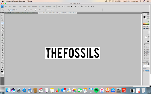
I used the magic wand selection tool in order to select the font so that I could remove the white background from it. By removing the white background, I am able to ensure that only the text will be pasted onto the new layer.
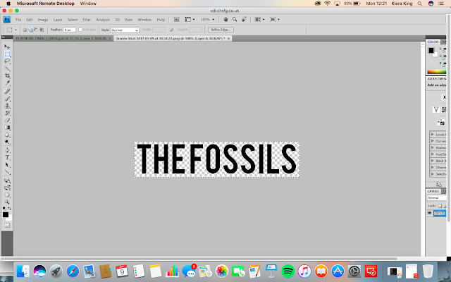
Once I had fully removed the white background I used the selection tool so that I could select the text and then copy and paste it onto the document where I was creating the front cover of the digipak.

Once I pasted the text onto this document, I right clicked on the layer and went on 'blending options' This then brought up a new tab which was about the styles of the layer. I then clicked on 'colour overlay'. This was to allow me to change the colour of the font so that it would match the colour scheme and stand out against the black background.
I then moved the font to a position above the lips and increased the size of it using the 'free transform' tool. Next, I wanted to increase the size of the lips because I felt like there was too much blank space. In order to do this, I clicked on the layer of the lips and used the 'free transform' tool. Whilst using this tool I held down the shift key on the keyboard to make sure that everything stayed in proportion.

Saturday, 7 January 2017
Digipak Font Examples
As I was undecided between two fonts, I decided to edit them onto the digipak front cover so that I could see what they would look like in my colour scheme and then choose the better looking font. These are the outcomes;
 |
| BebasKai-Regular |
 |
| Bebas |
From this I can tell that the font quality of 'BebasKai-Regular' isn't good enough which has caused it to go grainy in the edit process. This therefore makes the digipak from cover look unprofessional. Because of this, the font that I am going to use on my digipak is 'Bebas'.
Digipak Fonts
From the first draft of my digipak front cover, I decided that I wasn't the biggest fan of the font that I had used. Whilst this font worked well in my music video, I felt like it didn't look quite right on the front of my digipak. Therefore I decided to use the website 'dafont.com' in order to find some alternative fonts that I could use. I wanted to use a sans serif font because then the font will be vaguely similar to the one used in my music video.
Here are some of the fonts that I found;
'Built Titling':


I like this font, however I feel like the letter look too boxy; for example the letter 'S'. This puts me off of using this font.
'BebasNeue':


Whilst I like this font, I feel like the two titles look quite different in it. Which would make it appear as if there wasn't much consistency/fluency across the album.
'BebasKai-Regular':


This font is very similar to 'BebasNeue' which is why I like it. However I feel like this font looks more similar for the two titles in comparison to it. Therefore I am more likely to use this font.
'Bebas':


Again this font is very similar to the other 2 fonts because they are from the 'bebas' family. Out of all of them, this is the font I like the most. This is because I like the spacing between the letters. Therefore I think that is likely that I will use this font on my digipak.
From researching and finding these fonts, I have decided that I do not want to use the first 2 fonts (BuildTitling and BebasNeue). This is because I dont like them as much a the last two fonts. To help me decide which font to use, I am going to put both onto my digipak and see which one works and looks the best.
Friday, 6 January 2017
Digipak Track List
After looking at other indie rock albums, I have now come up with the track list for the album 'Ultraviolet' by The Fossils. I have decided to include 10 songs on this album, these songs will be called;
1. 123
2. BAD HABITS
3. LOST & FOUND
4. ANYTHING
5. TEENAGE ANGST
6. REVENGE
7. LONDON
8. ROSE
9. WRECKED HEART
10. FLAME
Now that I have come up with the album track list and album title, I can start to design and create the back cover for my digipak.
1. 123
2. BAD HABITS
3. LOST & FOUND
4. ANYTHING
5. TEENAGE ANGST
6. REVENGE
7. LONDON
8. ROSE
9. WRECKED HEART
10. FLAME
Now that I have come up with the album track list and album title, I can start to design and create the back cover for my digipak.
Thursday, 5 January 2017
Digipak Back Cover Images
I have decided that on the back of my digipak, I want to include an image of the female actor who featured in the music video for the single 'Bad Habits'. This will create fluency between the two products. Therefore I went through my footage, in order to find parts of this actress which I thought would work for my digipak. When I found them I screen-shotted them for future use. These were the 3 parts that stood out to me and I decide to screenshot;


Because of the lighting used and the fact that I screen-shooted the images, they come across slightly grainy. However I quite like this effect because I feel like it is reflective of my genre and works well with the 'vibe' I'm going for with my digipak. Because I am unable to decide on which image I want to use on my digipak back cover, I will create drafts involving all of them so that I can get feedback from my target audience on which one they prefer.


Because of the lighting used and the fact that I screen-shooted the images, they come across slightly grainy. However I quite like this effect because I feel like it is reflective of my genre and works well with the 'vibe' I'm going for with my digipak. Because I am unable to decide on which image I want to use on my digipak back cover, I will create drafts involving all of them so that I can get feedback from my target audience on which one they prefer.
Wednesday, 4 January 2017
Social Media Responce: Album Title Ideas
In order to get feedback about my album title ideas, I got in contact with my target audience over social media. I asked them to pick their favourite title out of the 3 options and explain why this was their favourite.

These were the responses I received:


From this feedback, I can see that my target audience likes all of the album titles ideas. Because of this I have decided that I am going to use 'ultraviolet' as the album title for my digipak. I think that this will good be a good choice for the album and how layout/structure I want to follow.
Subscribe to:
Posts (Atom)