Monday, 27 February 2017
Sunday, 26 February 2017
Question One (Part Two)
What ways does your media products use, develop or challenge forms and conventions of real media products?
Script:
Script:
The video begins with a title slide, to introduce the band and is shortly followed by a title displaying the name of the song. The titles follow a simple and straightforward design which is carried out throughout the digipak and poster; this is to create fluency between all three media products.
I use close up shots in order to introduce the audience to the 2 characters within the video, this shot is often used in music video in order to make the audience familiar with the characters. By using both a male and female actor I have widened the audience who are likely to watch the video by it making it appealing to both genders.
Lip-syncing is another convention which I have followed. I have included close up shots of the male character lip-syncing throughout the whole of the music video. This is to portray to the audience that this is the lead singer of the band. Whilst lip-syncing the artist often makes eye contact with the camera therefore making the video appear more personal and direct to the audience .
Within the music video, I have included the musical instruments that are being played. This shows that I am using the conventions of indie rock music videos which also tend to include instruments. I put the clips of the instruments in black and white in order to contrast them with the coloured lip syncing clips; this was to make them stand out.
I have subverted the conventions of music videos by using a range of different colour filters throughout. This makes the video appear inconsistent despite the fact the range of colours is used to match the chaotic pace of the song.
Another convention which I have conformed to in my music video is the use of special effect editing, which is often used in indie music videos. I have overlapped clips in order to create chaos within my video in order to match the pace of the song. I also mirrored some of the clips to make it appear as if the artist is at war with himself over the women he is singing about.
I used strobe lighting throughout the whole of the video. The use of strobe mimics the lighting used at indie rock gigs/concerts therefore creating a similar atmosphere to those live performances which gives the video an energetic vibe and makes it more engaging.
Whilst I have used coloured filters and strobe, the lighting within the video is generally quite dark/stark. This lighting is often used in indie music videos as it helps to set a mysterious mood and atmosphere within the video.
Most indie rock videos follow some sort of narrative and combine that with performance elements. However I decided to make my music video completely performance based due to the fact I thought it would suit the pace of the song better. This shows how I have challenged the conventions of indie rock music videos.
I used a range of transitions within my music video in order to make it flow better to the pace of the music. Music videos generally used transitions for this same purpose this therefore shows that I have followed conventions.
Saturday, 25 February 2017
Monday, 20 February 2017
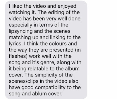
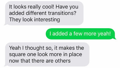
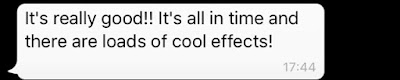
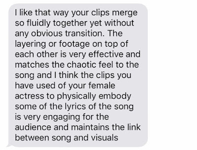
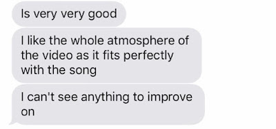
Music Video Final Draft: Target Audience Feedback
I wanted to find out what my target audience thought of the finished music video. Therefore I send them a link to the video using text messaging and asked what they thought. These were the responses:


Friday, 10 February 2017
Tuesday, 7 February 2017
Editing #4

When I began editing for my final draft I felt like one of the clips looked to similar to one that had already featured earlier on in the video. Before I decided to reverse the clip and slow it down. One slowed down I cropped the video so that it was just the actor looking directly into the camera instead of turning around. This made the clip look different to the earlier clip therefore making the video appear less repetitive.

I felt like this clip looked slightly awkward, therefore I decided to slow it down to make it seem somewhat sexier. I also darkened the clip as I found the lighting was too direct and looked particularly different to the rest of the clips. I did this using the 'convolution kernel' tool.
Digipak Final Products: Target Audience Feedback
I wanted to find out what my target audience thought of the digipak I created for the album 'Ultraviolet' by The Fossils. I sent them a link to the blog post displaying all of the products and then asked them to tell me what they thought of it and if there was anything in particular that they liked or disliked. These were the responses;


This feedback shows that my target audience generally like the outcome of my digipak. They like the simple style which I used and how I used it consistently throughout the whole of the digipak. In addition to this they like the colour scheme of red, black and white which I also used consistently throughout the digipak. There are only slight improvements that my target audience have recommended to me that I could improve, however overall I am happy with the outcome of the digipak and will not make any further adjustments/alterations to it.


This feedback shows that my target audience generally like the outcome of my digipak. They like the simple style which I used and how I used it consistently throughout the whole of the digipak. In addition to this they like the colour scheme of red, black and white which I also used consistently throughout the digipak. There are only slight improvements that my target audience have recommended to me that I could improve, however overall I am happy with the outcome of the digipak and will not make any further adjustments/alterations to it.
Friday, 3 February 2017
Music Video Second Draft:Target Audience Feedback
After completing the second draft of my music video I decided to send the link of it to some people within my target audience to find out what they thought about my music video and if they thought there was anything that could be improved.


From this I can tell that my target audience really like the second draft of my music video. They fans of the use of overlapped clips and the range of colours that were used.They think that the lip syncing within my video could be slightly improved so for my final draft I will try and improve that.


From this I can tell that my target audience really like the second draft of my music video. They fans of the use of overlapped clips and the range of colours that were used.They think that the lip syncing within my video could be slightly improved so for my final draft I will try and improve that.

Thursday, 2 February 2017
Music Video Second Draft
This is the second draft of my music video. There were a few errors which have occurred since exporting the video therefore I will need to go back and adjust them for my final draft. These errors include the fact the band names appears 8 seconds before the audio plays and that the hand overlay clip is larger than the rest of the footage. However I will still gain additional feedback on my video from my target audience so that I can find out what they think I could change and improve before my final draft.
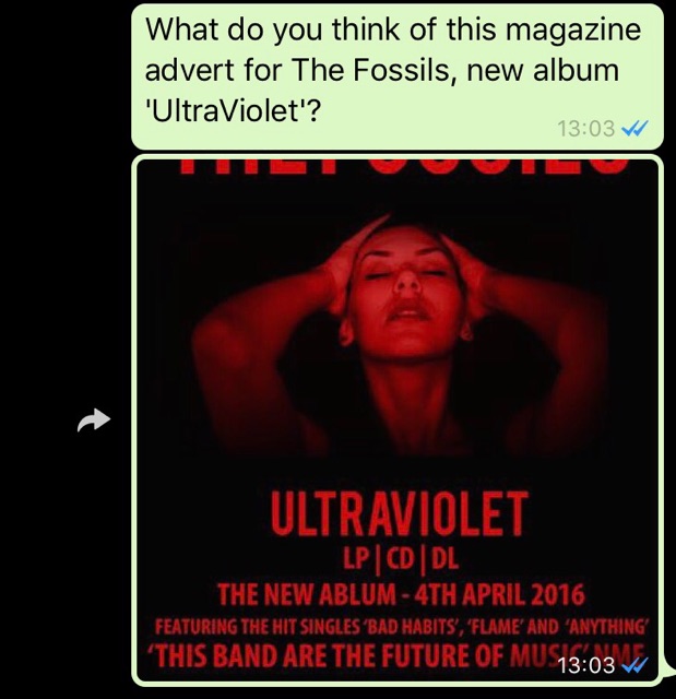
Magazine Advert: Target Audience Feedback
I decided that I wanted to gain feedback from my target audience so I could find out what they thought of the magazine advert. I sent out this message alongside the advertisement.

These are the responses I received:


This feedback shows that my target audience really like the outcome of my magazine advertisement. They agree that it looks professional and that the colour scheme works well. I have now noted the grammatical error on the front cover and will make sure to change that and update it so that it is even more professional.

Wednesday, 1 February 2017
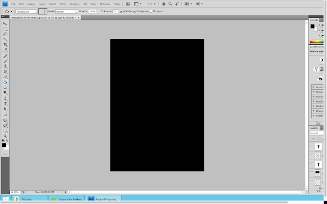
Magazine Advert Construction
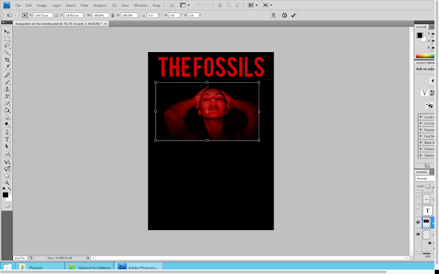
In order to promote the band and their album, I have created a magazine advert which could feature in a range of music magazine. To start the creation of the advert, I opened up an A4 document on Adobe Photoshop. Then using the paint bucket tool, I coloured the whole page black.
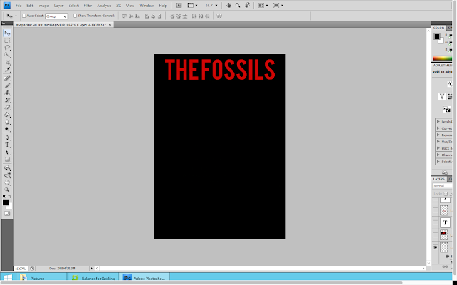
I then copied the bands name from the front cover of the digipak and pasted it onto the advert as a new layer. I used the free transform tool to adjust the size of the text as I wanted it to fill up the top of the advert.
I decided that I was going to use an image from the music video on this magazine advert. I thought that it would also be best to use one of these images which also featured on the digipak, in order to show that all of the products were connected/related. I opened up the image and pasted in onto this document as a new layer. I then used the free transform tool to adjust the size of the image. Once I was happy with the sizing of the image I moved the image so that it was below the bands name and that there was an equal amount of space either side of it.
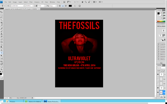
Below this image I placed the album name. Again I copied this from the digipak back cover to ensure that the font style and colour looked exactly the same. I again used the free transform tool to adjust the size of the text. However I decided to make this font smaller than the bands name as I feel as if it is more important to reinforce the bands name to the audience to make them appear as a brand.

Using the text tool, I decided to type out some information about the album. This information included the options it is available on (CD and LP), the release date as well as some of the songs featured on the album. For this I used the same shade of red on the rest of the advert as well as across the whole digipak.
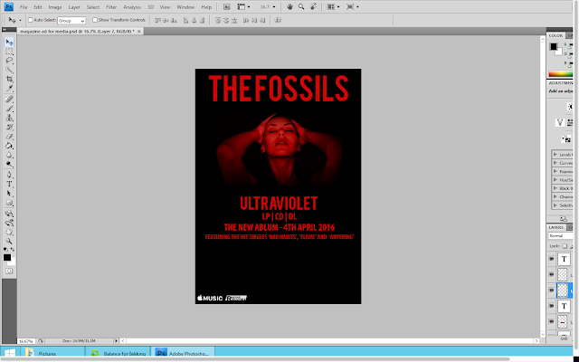
In the bottom left hand corner I decided to put some other information about where the album would be available. I went onto google and saved the apple music logo. I then opened it on photoshop where I pasted it as a new layer. I then moved it down to the bottom left hand corner and used the free transform tool to adjust the size of it.

Next to the apple music logo I then decided to the put record label logo. I used the same method to to this.
I felt as if there was a lot of blank space on the advert still so I decided to include some more information about the album. I used the text tool in order to type out an review quote from the music and lifestyle magazine NME. I continued to use the same font style and colour as the rest of the information.
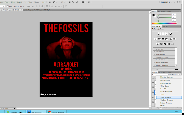
However I still felt as if there was too much blank space. Therefore I added a star review from another music magazine; Rolling Stone. I went onto google images and found a black PNG 5 Star Review. I saved this into my images and then opened in onto photoshop. When I pasted it onto photoshop, I used the colour overlay tool to make the stars the same colour as the rest of the text on the advertisement. I then used the free transform tool to adjust the size of the stars. When I was happy with their sizing, I positioned them centrally below the album review quote. Then below the stars I typed out who the review was from (Rolling Stone)
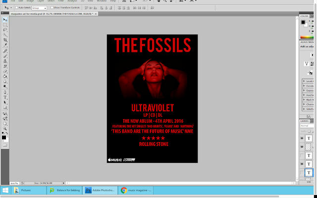
Finally, I wanted to add the website address for the band. So using the tex tool, I typed out the address matching the font style and colour to the rest on the page. I then placed this underneath the star review from rolling stone and made the font rather small to suggest that it wasn't particularly important.
Overall I am happy with the outcome of my magazine advert. It remains reflective of the genre of the band and links well to both the music video and digipak thereby showing fluency between all of my products. I think that my advert looks realistic to other adverts and could actually be using in a magazine.

I then copied the bands name from the front cover of the digipak and pasted it onto the advert as a new layer. I used the free transform tool to adjust the size of the text as I wanted it to fill up the top of the advert.

I decided that I was going to use an image from the music video on this magazine advert. I thought that it would also be best to use one of these images which also featured on the digipak, in order to show that all of the products were connected/related. I opened up the image and pasted in onto this document as a new layer. I then used the free transform tool to adjust the size of the image. Once I was happy with the sizing of the image I moved the image so that it was below the bands name and that there was an equal amount of space either side of it.

Below this image I placed the album name. Again I copied this from the digipak back cover to ensure that the font style and colour looked exactly the same. I again used the free transform tool to adjust the size of the text. However I decided to make this font smaller than the bands name as I feel as if it is more important to reinforce the bands name to the audience to make them appear as a brand.

Using the text tool, I decided to type out some information about the album. This information included the options it is available on (CD and LP), the release date as well as some of the songs featured on the album. For this I used the same shade of red on the rest of the advert as well as across the whole digipak.

In the bottom left hand corner I decided to put some other information about where the album would be available. I went onto google and saved the apple music logo. I then opened it on photoshop where I pasted it as a new layer. I then moved it down to the bottom left hand corner and used the free transform tool to adjust the size of it.

Next to the apple music logo I then decided to the put record label logo. I used the same method to to this.

I felt as if there was a lot of blank space on the advert still so I decided to include some more information about the album. I used the text tool in order to type out an review quote from the music and lifestyle magazine NME. I continued to use the same font style and colour as the rest of the information.

However I still felt as if there was too much blank space. Therefore I added a star review from another music magazine; Rolling Stone. I went onto google images and found a black PNG 5 Star Review. I saved this into my images and then opened in onto photoshop. When I pasted it onto photoshop, I used the colour overlay tool to make the stars the same colour as the rest of the text on the advertisement. I then used the free transform tool to adjust the size of the stars. When I was happy with their sizing, I positioned them centrally below the album review quote. Then below the stars I typed out who the review was from (Rolling Stone)

Finally, I wanted to add the website address for the band. So using the tex tool, I typed out the address matching the font style and colour to the rest on the page. I then placed this underneath the star review from rolling stone and made the font rather small to suggest that it wasn't particularly important.

Overall I am happy with the outcome of my magazine advert. It remains reflective of the genre of the band and links well to both the music video and digipak thereby showing fluency between all of my products. I think that my advert looks realistic to other adverts and could actually be using in a magazine.
Subscribe to:
Posts (Atom)