Sunday 4 December 2016

Editing #3

I have continued to edit the final minute of my music video on premier pro in order to create my first draft. Throughout the editing process, I have been using similar tools and effects in order to show fluency within my video.

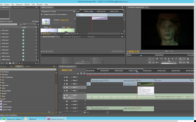
 For this section of the video, I layer two clips of the different actors over one another; this was because I wanted layering to be a consistent theme within my video. However on one of the clips, I used the zoom transition so that the clip of the male singer would end up being the only one within the shot. This was to show that he was the main actor within the video - it also fitted well with the music.


There was a section of music where it began to slow down in pace slightly, therefore I wanted the footage to match the pace. To do this I changed the speed of specific clips so that they were slowly and less 'jumpy'.

Friday 2 December 2016

Digipak Track List Research

I decided to look at the track listing for some albums by indie rock artists so that I could could an idea of the amount of songs bands usually include on their albums as well as what they name them.


I found that generally the albums tend to have around 10-12 songs which vary in length. From this information I decided to create an online poll so that I could find out how many tracks my target audience would like to see on my digipak. I created my poll online using a website called 'poll everywhere'. I then sent the link to people using social media and instant text messaging.


I sent this poll link out to 15 people, and these were the results:


From the results I can tell that my target audience would expect to see 9-11 songs on a digipak. This happens to be reflective of the research that I conducted into already existing indie rock albums. Because of this, I am going to include at least 11 songs on my digipak. I now need to come up with some names for them. Therefore I am going to research indie rock songs and see what they generally are called in order to make mine as similar to the conventions of the genre as possible.

Thursday 1 December 2016

First Draft // Digipak Front Cover

This is the first draft of my digipak. Overall I am happy with the outcome of this, but I am not entirely sure if I am happy with the text on the page. I feel like it looks a bit strecthed out even though it inst. Therefore I am going to send this image to my target audience on social media to find out what they think of it and if they think that there is anything I could improve on/change. 


Digipak Front Cover Construction #2

I have continued the creating the front cover of my digipak. I decided to only add the band name on the front of my cover because of the response from target audience in the digipak questionnaire.


To add the band name to my front cover, I added a new layer and applied the text tool. I dragged the text box over the middle of the drawing in the center of my cover. I used the same font that I used in my music video in order to show consistency/fluency between my products. I also made it the same colour.


I noticed that that wasn't the exact same font, then I realized that it was because I made the font in my music video 'bold condensed italic'. Therefore I changed this on photoshop to make it the same. I then pressed the tick in order to apply this and then that was the first draft of my digipak!