A2 Media Studies
Saturday, 8 April 2017
Monday, 6 March 2017
Monday, 27 February 2017
Sunday, 26 February 2017
Question One (Part Two)
What ways does your media products use, develop or challenge forms and conventions of real media products?
Script:
Script:
The video begins with a title slide, to introduce the band and is shortly followed by a title displaying the name of the song. The titles follow a simple and straightforward design which is carried out throughout the digipak and poster; this is to create fluency between all three media products.
I use close up shots in order to introduce the audience to the 2 characters within the video, this shot is often used in music video in order to make the audience familiar with the characters. By using both a male and female actor I have widened the audience who are likely to watch the video by it making it appealing to both genders.
Lip-syncing is another convention which I have followed. I have included close up shots of the male character lip-syncing throughout the whole of the music video. This is to portray to the audience that this is the lead singer of the band. Whilst lip-syncing the artist often makes eye contact with the camera therefore making the video appear more personal and direct to the audience .
Within the music video, I have included the musical instruments that are being played. This shows that I am using the conventions of indie rock music videos which also tend to include instruments. I put the clips of the instruments in black and white in order to contrast them with the coloured lip syncing clips; this was to make them stand out.
I have subverted the conventions of music videos by using a range of different colour filters throughout. This makes the video appear inconsistent despite the fact the range of colours is used to match the chaotic pace of the song.
Another convention which I have conformed to in my music video is the use of special effect editing, which is often used in indie music videos. I have overlapped clips in order to create chaos within my video in order to match the pace of the song. I also mirrored some of the clips to make it appear as if the artist is at war with himself over the women he is singing about.
I used strobe lighting throughout the whole of the video. The use of strobe mimics the lighting used at indie rock gigs/concerts therefore creating a similar atmosphere to those live performances which gives the video an energetic vibe and makes it more engaging.
Whilst I have used coloured filters and strobe, the lighting within the video is generally quite dark/stark. This lighting is often used in indie music videos as it helps to set a mysterious mood and atmosphere within the video.
Most indie rock videos follow some sort of narrative and combine that with performance elements. However I decided to make my music video completely performance based due to the fact I thought it would suit the pace of the song better. This shows how I have challenged the conventions of indie rock music videos.
I used a range of transitions within my music video in order to make it flow better to the pace of the music. Music videos generally used transitions for this same purpose this therefore shows that I have followed conventions.
Saturday, 25 February 2017
Monday, 20 February 2017
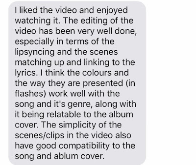
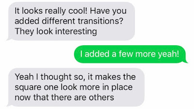
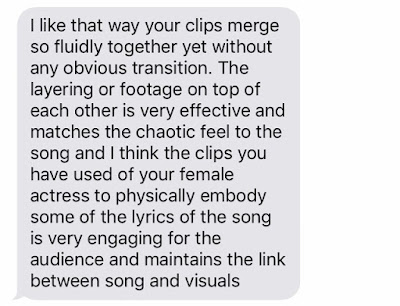
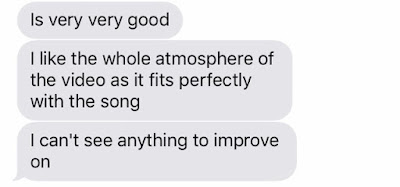
Music Video Final Draft: Target Audience Feedback
I wanted to find out what my target audience thought of the finished music video. Therefore I send them a link to the video using text messaging and asked what they thought. These were the responses:



Friday, 10 February 2017
Subscribe to:
Comments (Atom)